LEARNING SEEDS
Insights dashboard
Overview
Learning Seeds, a Boston-based ed-tech startup was looking to scale their services by creating a web-based insights platform.
Role
I performed user research and designed the insights dashboard including a style guide and key flows.
TL;DR
Project goal
Learning Seeds is looking to reduce the current bottleneck caused by their lack of a digital platform that would allow their users to access and use their program autonomously.
Research goals
Through discussion with Learning Seeds, we decided the best target user would be the paraprofessional. Their needs most overlap with the parents and teachers who are also using their program.
We established research goals to help uncover and understand the problem.
We looked at several non-profits and donation companies.
1. Understand the content of Learning Seed's program.
We looked at several non-profits and donation companies.
2. Learn how users understand the program content.
We looked at several non-profits and donation companies.
3. Uncover pain points of paraprofessional when assisting children.
We looked at several non-profits and donation companies.
4. Learn common design standards for educational blogs, and parent help websites.
We looked at several non-profits and donation companies.
Content familiarization
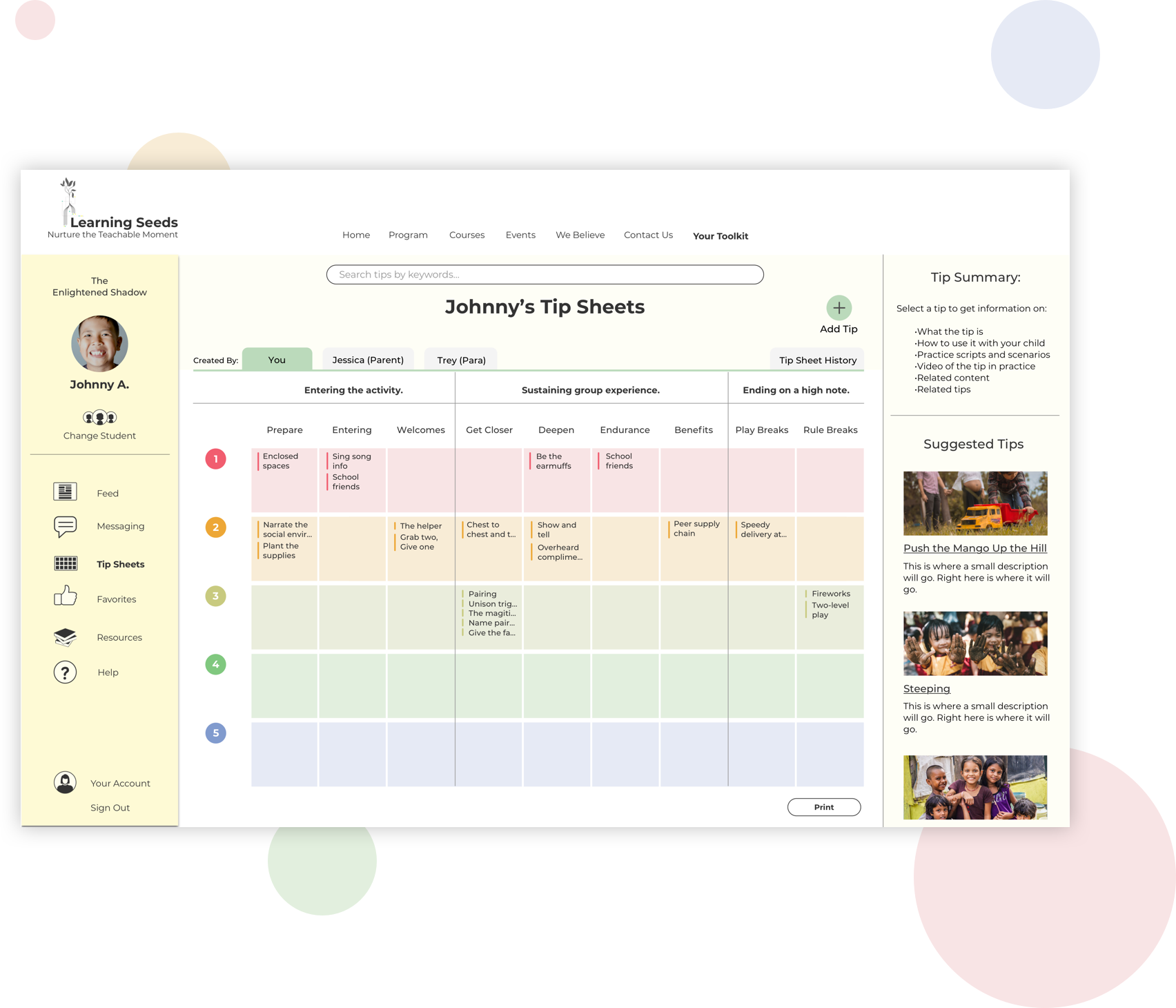
Our first challenge was to understand the content of the program. The Enlightened Shadow program is based around "tips" which are methods that parents, paraprofessionals, and teachers can use to help their children learn new pro-social behavior. These tips are tracked on a matrix that organizes the tips by level (1 most extreme behavior - 5 least extreme behavior) and whether the behavior occurs before, during, or after an activity.
Because the tips were exclusively created and used by Erica, there are lingo and descriptions that were difficult for us to interpret. Our first step was to take the tip descriptions supplied by Learning Seeds and put them into an open card sort to see how it was understood by others with the goal of creating the foundation for a successful browsing experience.
We created a screener and gave the card sort to the paraprofessionals and parents who responded to the screener. The majority of the users could categorize the tips into descriptive categories like 'Sensory Strategies'. But some users had some difficulty understanding what the tips meant.
We discovered this exercise could become a project of its own. So we cut it short due to time restrictions and added it to the strategy guide for Learning Seeds to pursue further at a later time.
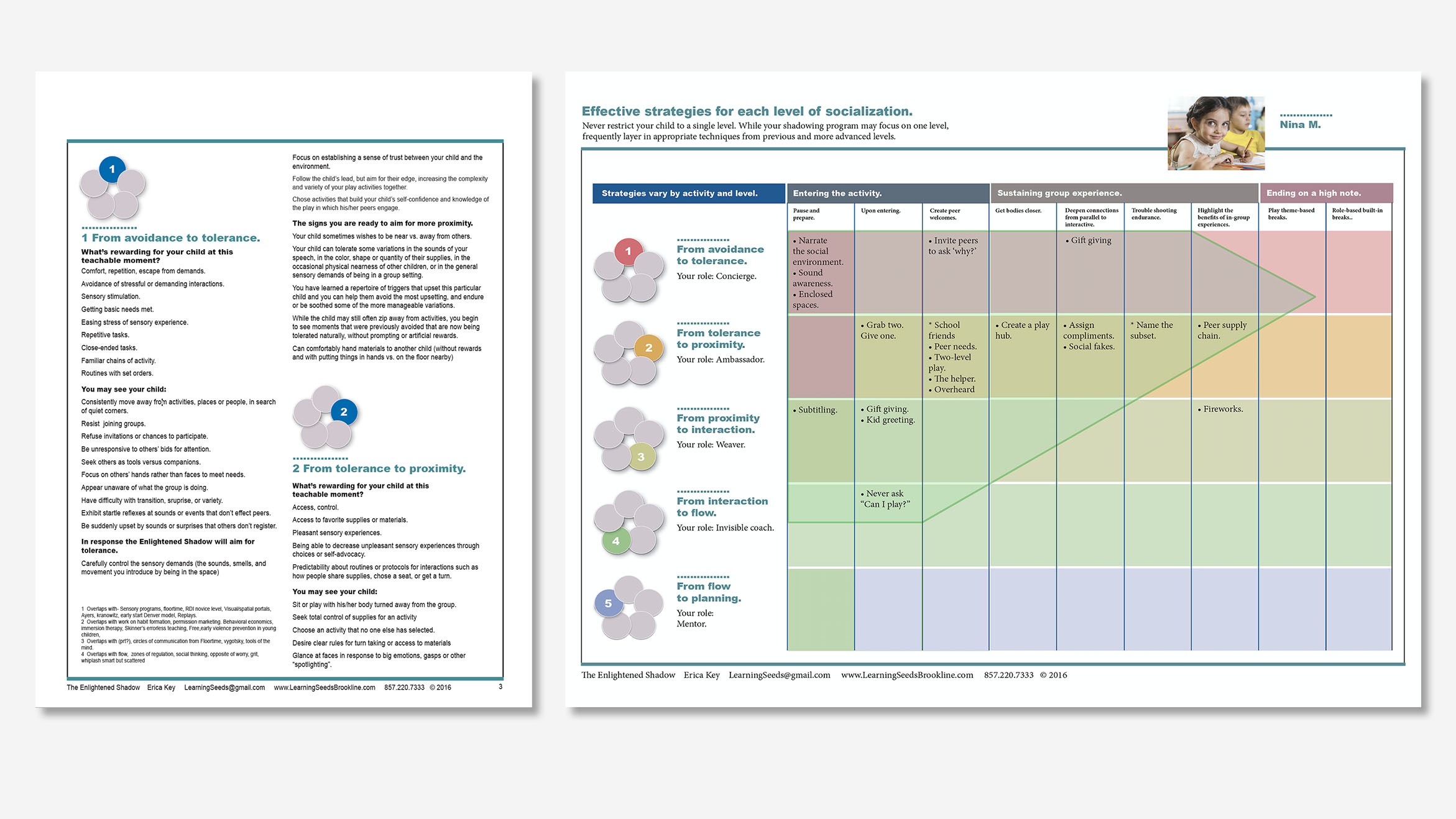
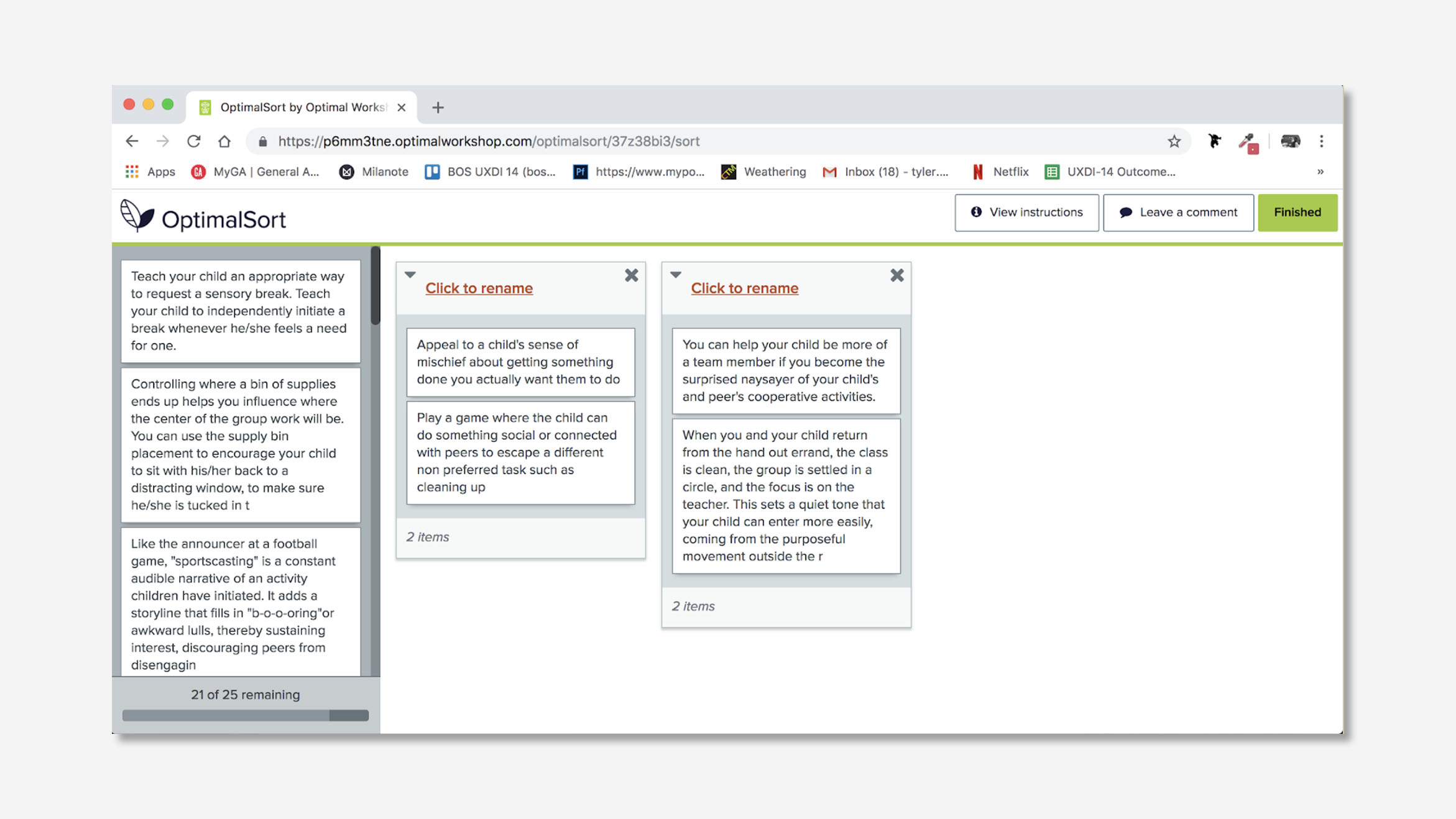
(Image 1) The Enlightened Shadow content provided by Learning Seeds. Level descriptions (left), tip sheet (right). (Image 2) Card sort using tip descriptions from The Enlightened Shadow program.
Learning from parenting blogs
I performed a competitive analysis of several websites like Understood.com, a reference guide for parents. I found the clearest IA was separating general content from personalized content that was placed in an account required portal.
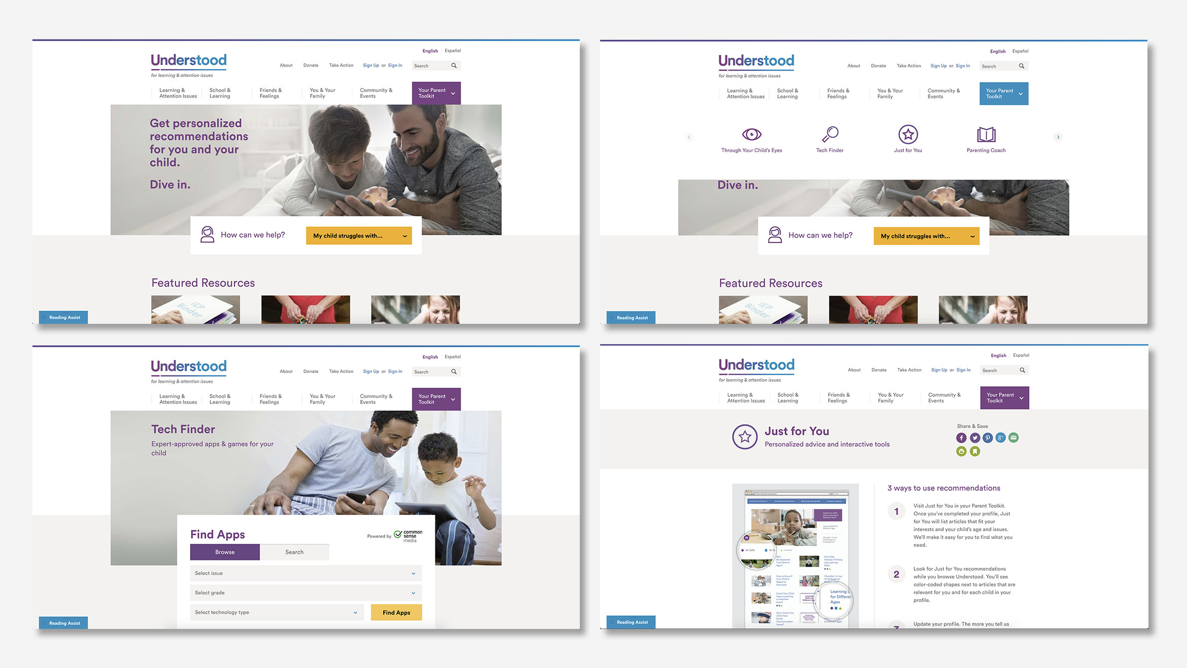
The competitive analysis I performed of Understood blog. Homepage (top left), Your Parent Toolkit navigation (top right), Tech Finder within the toolkit (bottom left), Personalized suggestions page 'Just for You' (bottom right).
Finding a problem
The team also performed eight twenty-minute user interviews to discover the pain points of our target user, the paraprofessional. I performed 2 of the interviews and discussed current pain points in charting the child's progress, managing multiple caseloads, and assisting children with social and emotional challenges.
We broke down the research and found that the paraprofessionals are generally overworked and have a high turn over. This limits their ability to connect with the children they are helping. The child also suffers from high turnover. Each child's needs are highly specialized and with no good method of documentation, each para has to relearn and troubleshoot strategies again.
Key insights
- I need an easy way to communicate with all the individuals working with a child
- I rely on professionals for determining individualized plans for children
- I use online tools to access information to work with children
- I need an efficient way to track my child's' progress
- I need a way to create personalized plans for multiple children
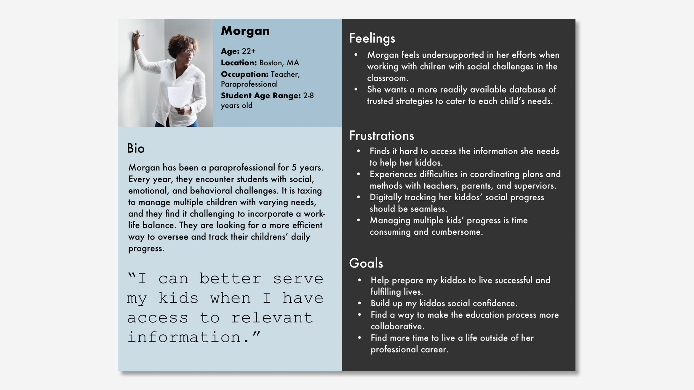
Proto-persona of the busy paraprofessional or personal aid.
Solving the problem
Keeping all these things in mind, the team decided on this mission statement:
Create consistent care for children with social & behavioral challenges.
This will be achieved through several goals:
- Create a way to track/share strategies used with a child
- Increase time working with children by reducing time in the application
- Reduce the learning curve for paraprofessionals and parents
Sketches and wireframes
To generate ideas the team did a 2-round design studio, each round was 5 minutes of sketching, 2 minutes presenting to the team, and 5 minutes of feedback. Each team member did this for their user flows.
My sketches were focused on Learning Seeds' goal of creating an easy and encouraging experience that would inspire users to learn and try new techniques that they can try with their kids. I sketched out ways in which people could manage their tips in the tip check-in, and how the global navigation would look within the Enlightened Shadow Toolkit.
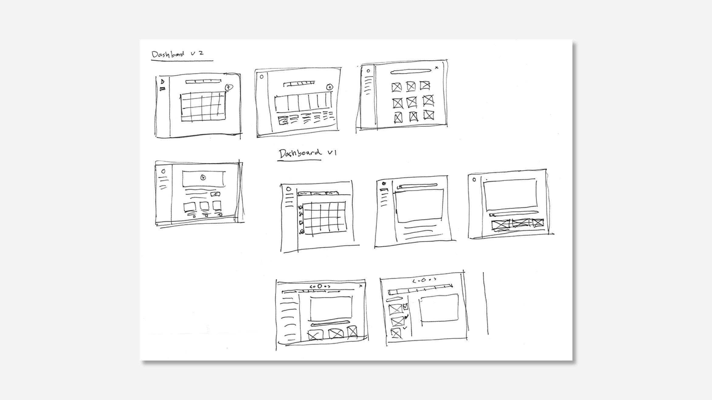
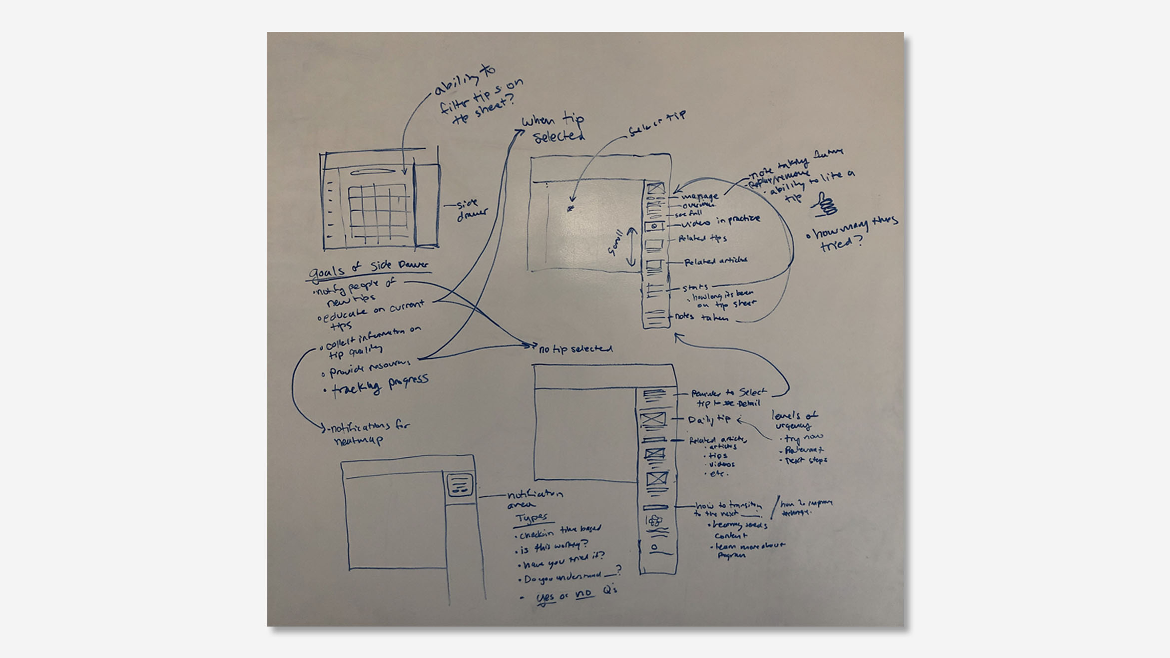
Page 1 shows my design studio sketches of the tip sheet feature. Page two shows my initial site map (left), preliminarily scheduled tip check-in (middle), the Enlightened Shadow online program location on the Learning Seeds website (right).
Primary touchpoints
The paraprofessional needs a way to track and manage the tips they are using with the children they are assisting. So I developed three user flows in Sketch which allows them to interact and manage their content which includes, adding a tip, adjusting a tip, and the scheduled tip check-in.
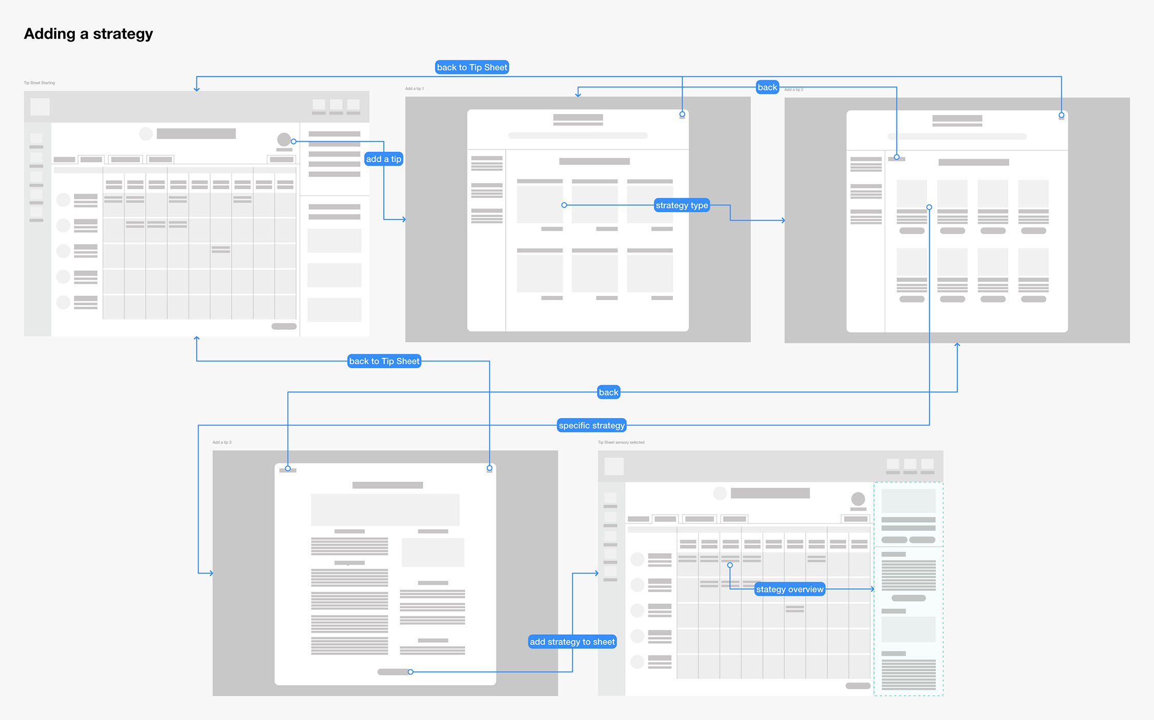
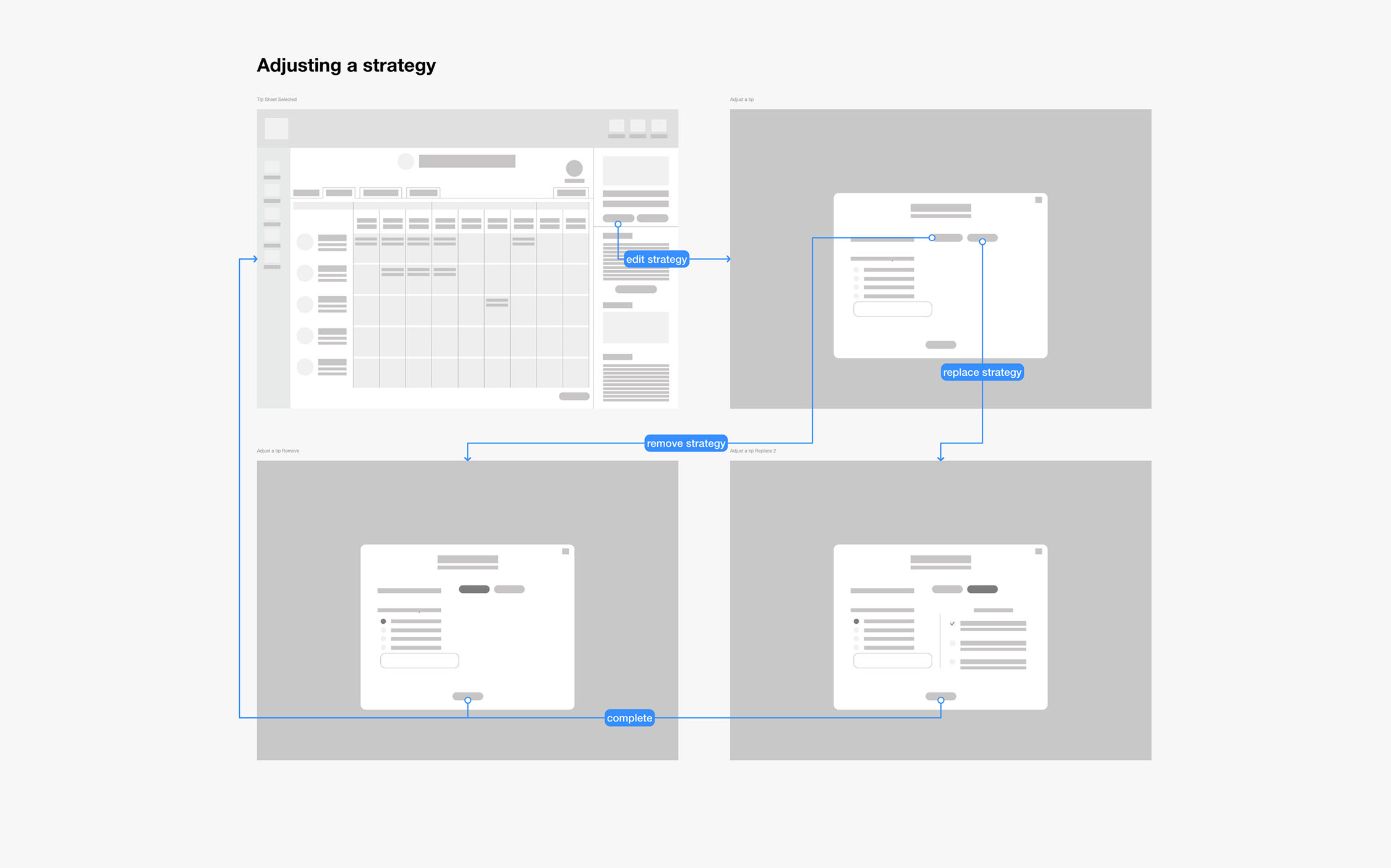
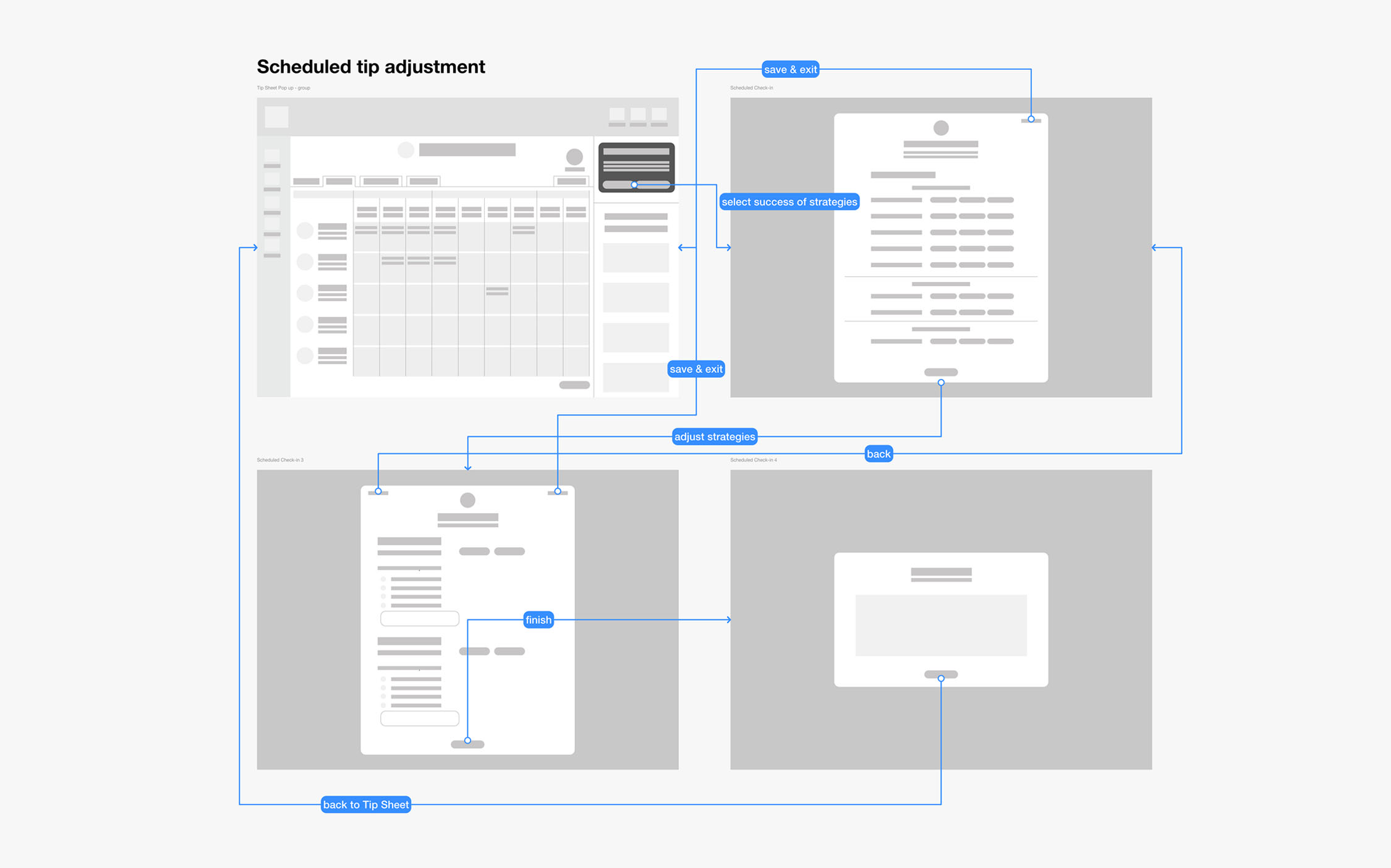
User flows Adding a tip to the tip sheet (image 1), adjusting a tip by removing or replacing (image 2), adjusting all the tips on the tips sheet through a scheduled tip check-in (image 3).
Design refinement
Below are the revisions that I made based on usability test feedback. Major feedback included reducing text and improving clarity within the matrix when changes have been made to the content. These changes are addressed in detail below.
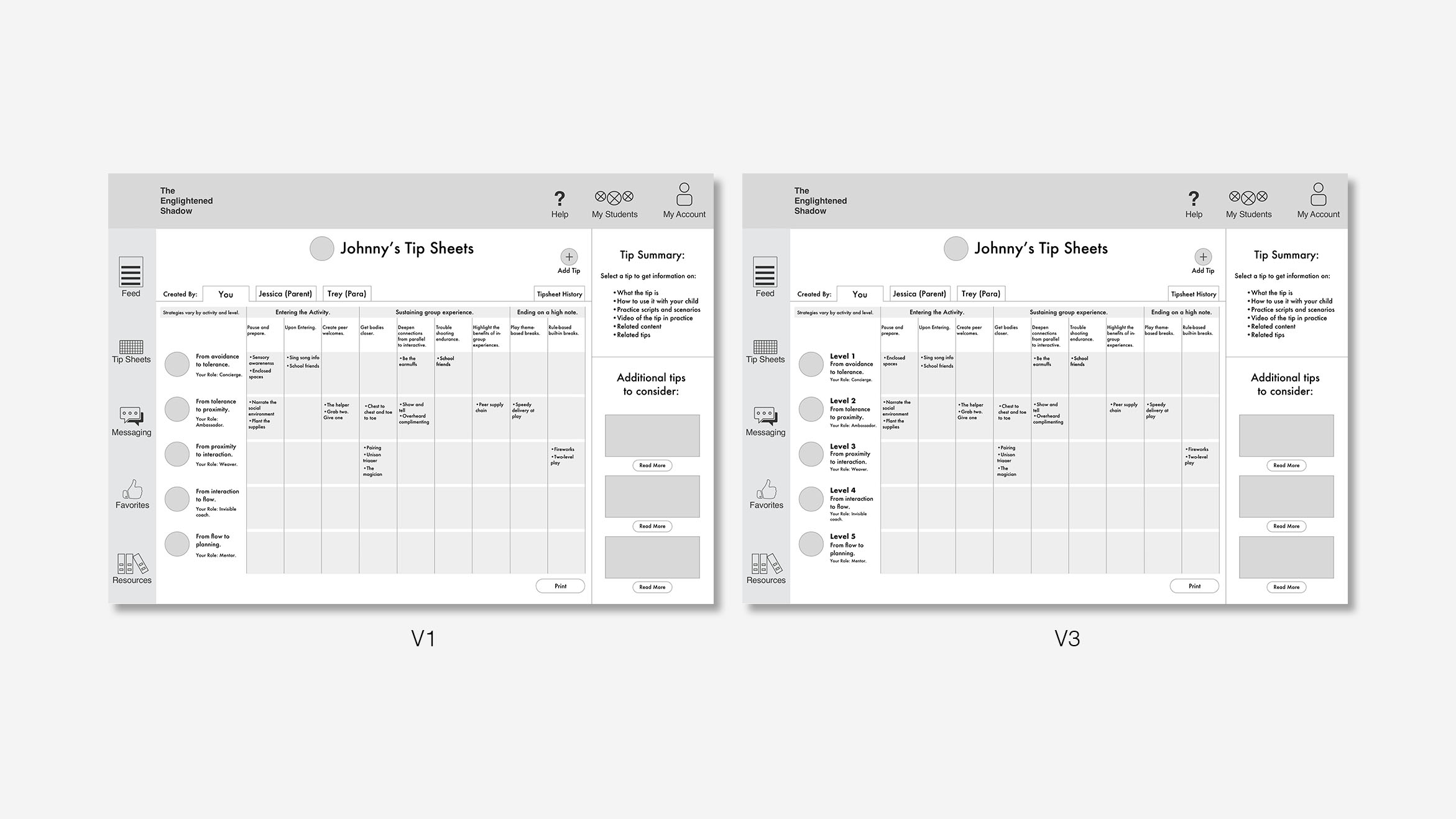
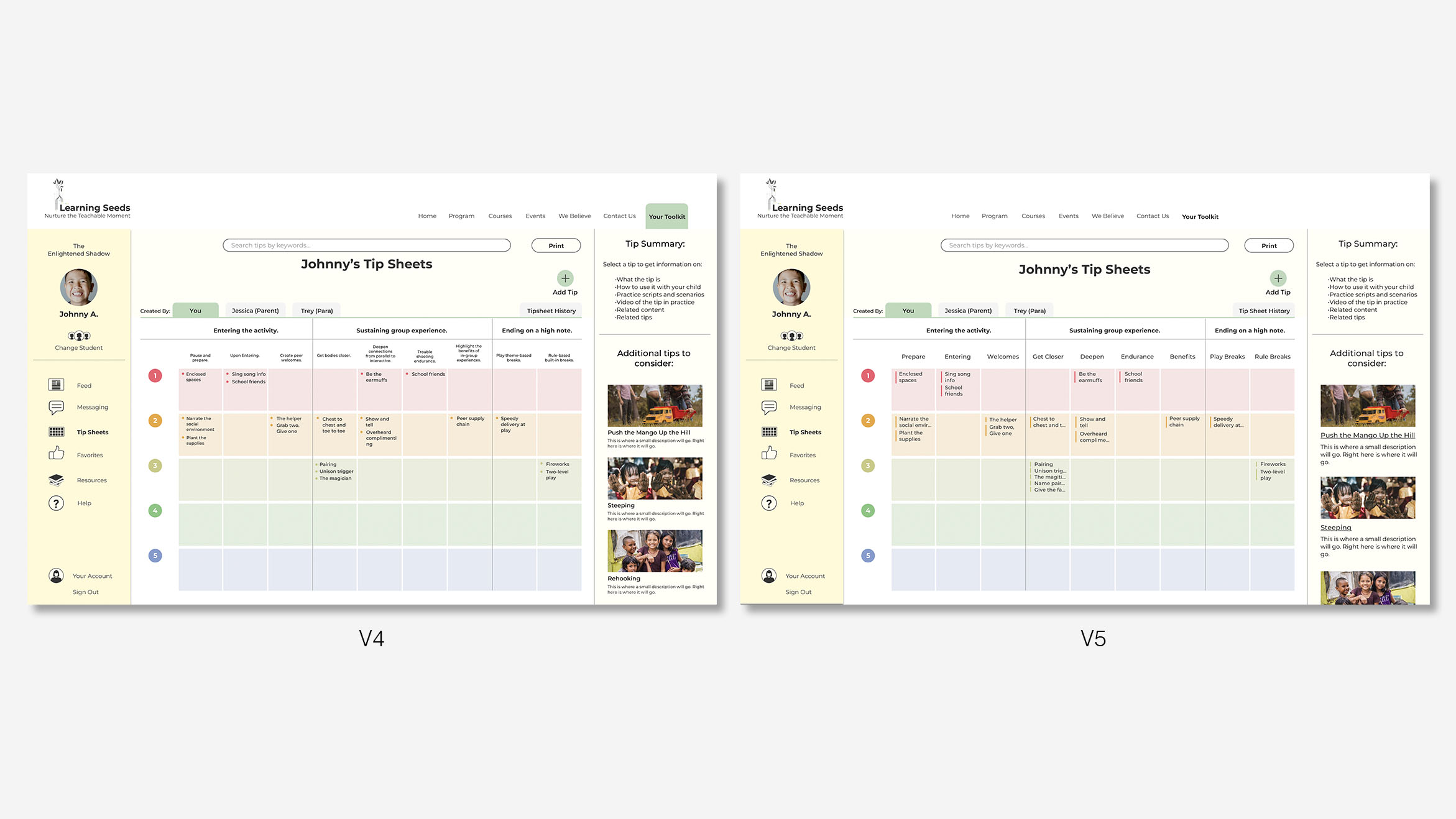
Tip sheet iterations. Page 1 shows version 1 (left), version 3 (right). Page 2 shows version 4 (left), version 5 (right).
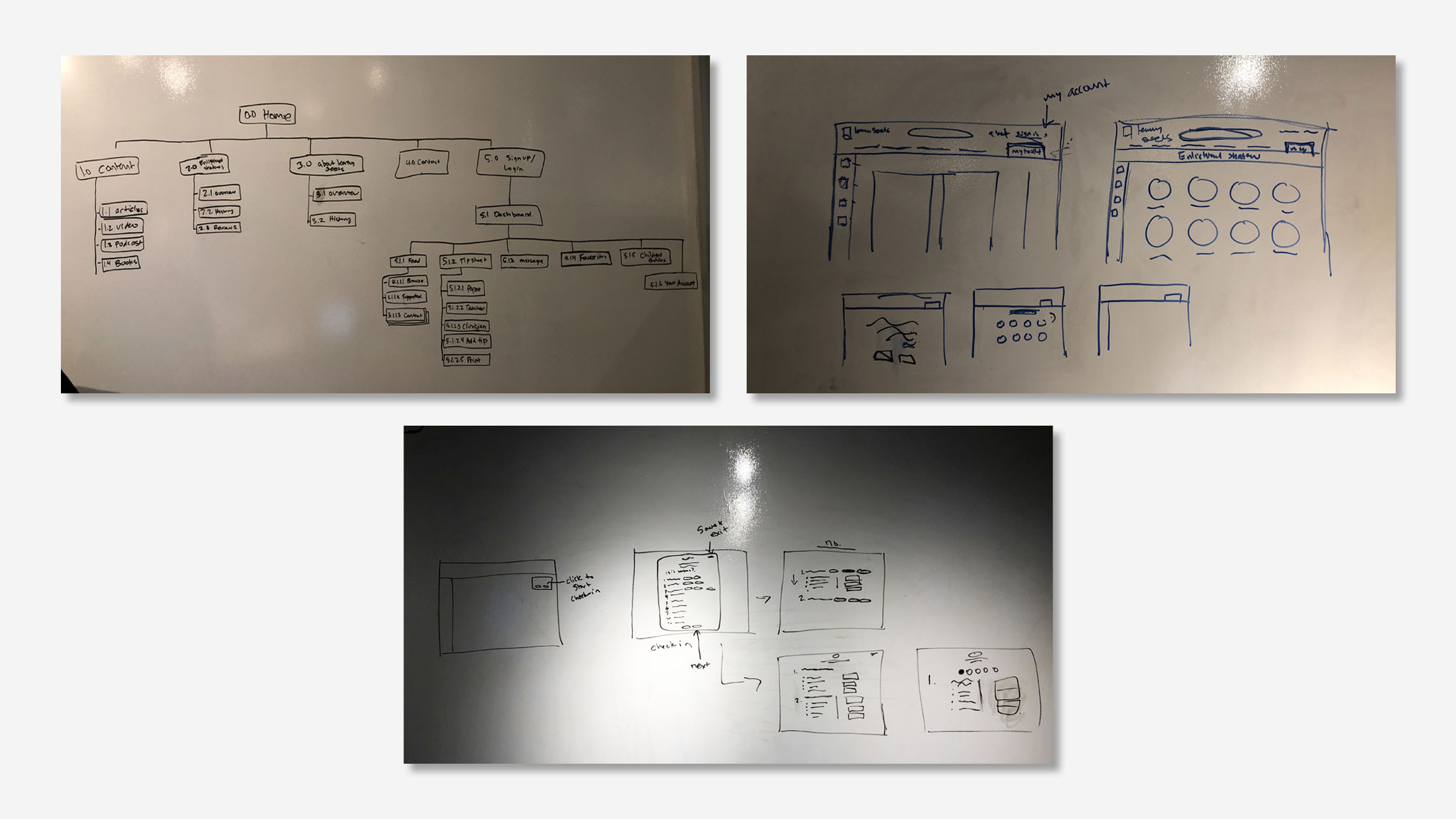
Integrating into existing site IA
After designing the flows the team re-evaluated the integration of the application with Learning Seeds' existing website. In order to eliminate issues moving between the portal and the general website, we nested the application under a tab with a universal login.
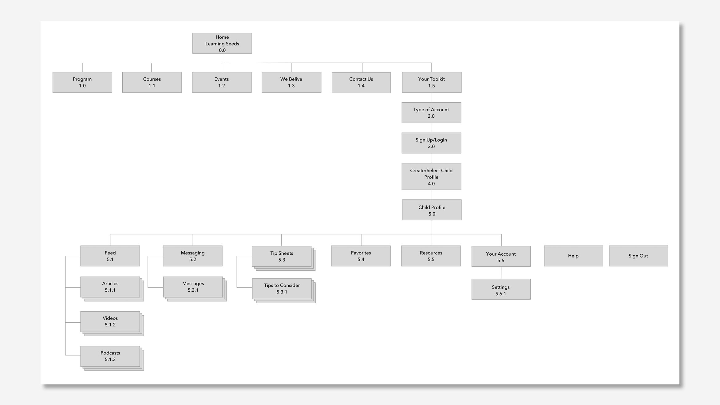
Site map showing buildout of our design integrated into the structure of the existing information architecture.
Centralizing navigation
After deciding the application would be a web-based portal, I changed the global navigation to separate the portal nav from the website nav.
We also wanted to address the needs of the paraprofessional by providing multi-student profile management, your account, and a help feature that when selected activates an on-hover information panel that will provide and as needed onboarding.
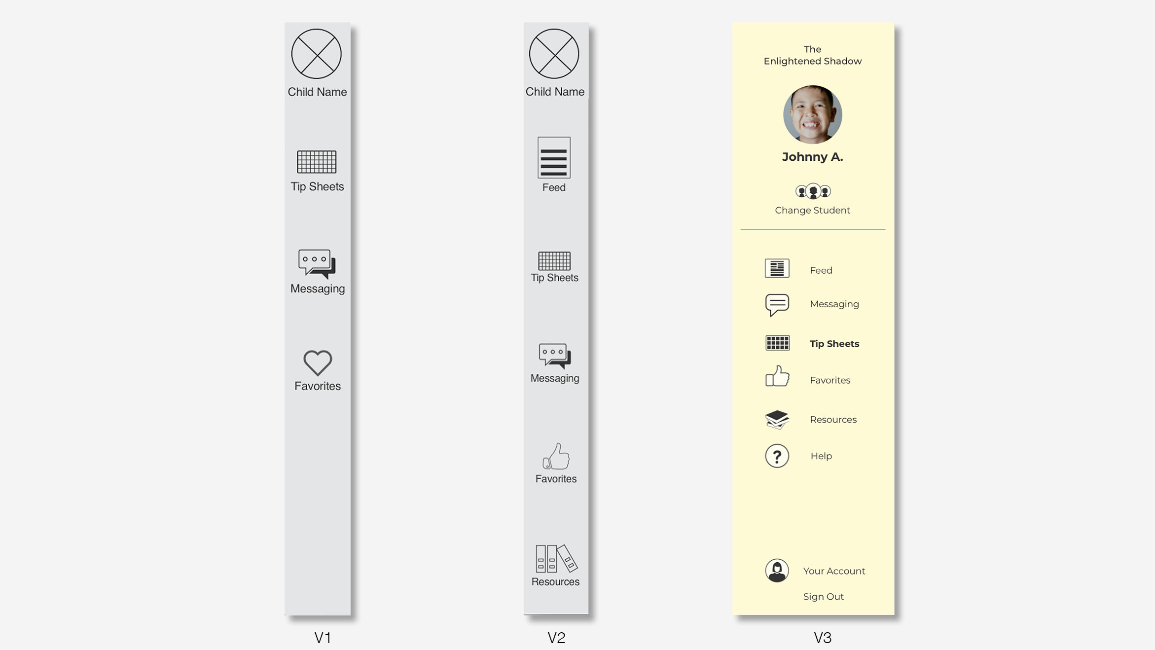
The team's initial wireframes of the global navigation (left, middle). My refinement of global navigation (right).
Reducing cognitive load
To answer goals 1 and 3 the tip sheet went through a series of iterations to reduce cognitive load and improve ease of use. V1 recreated the paper matrix that we received from Learning Seeds. The changes improve the visual clarity of the matrix by reducing the amount of text, increasing the size of text, changing the separations to white, using icons in place of text.
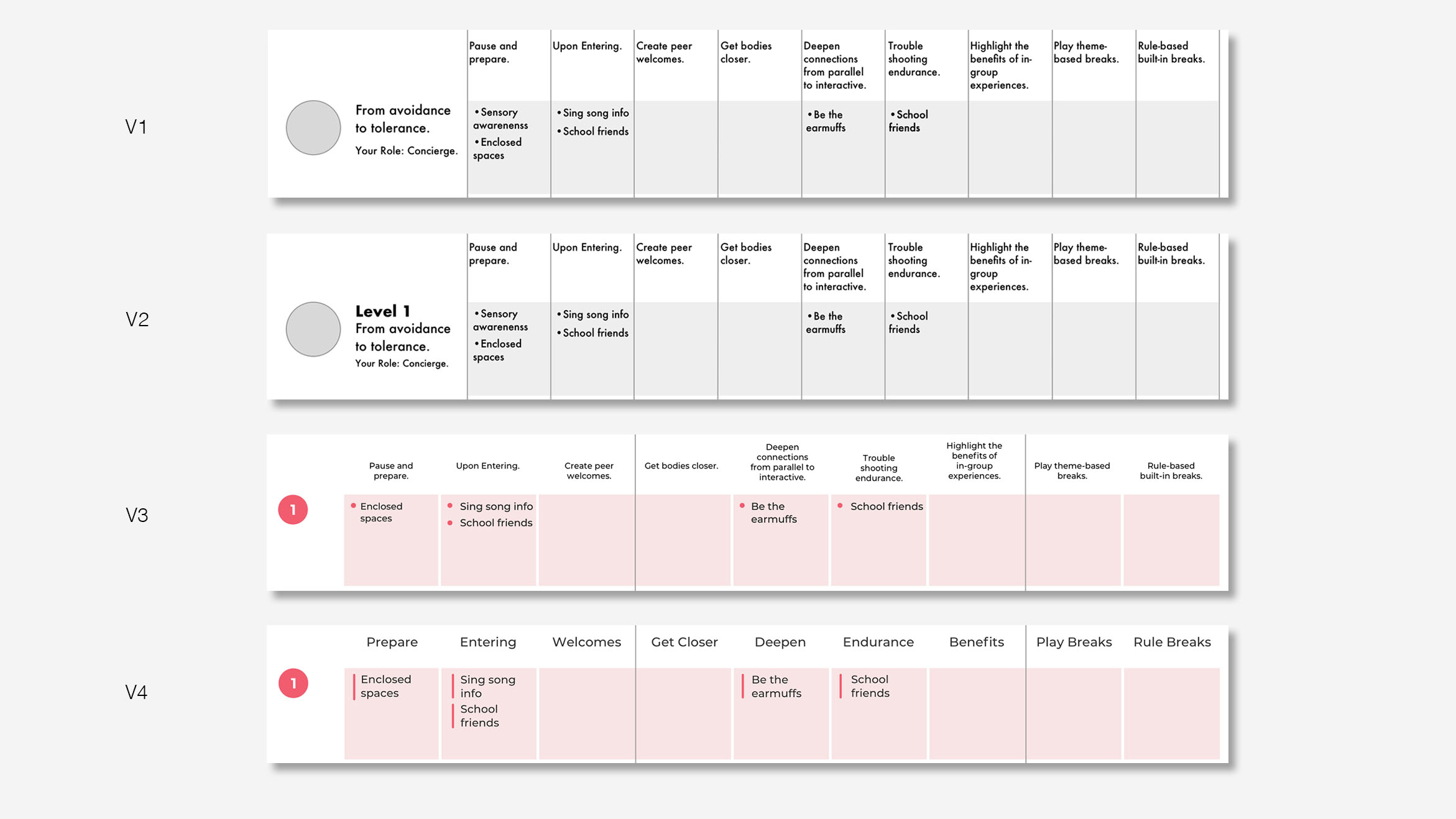
Snapshot of iterative changes on the tip sheet matrix.
Micro interactions
Another important consideration was how interaction helps improve the usability of the matrix. To start I referenced various calendar applications to better understand how the calendar's display and highlight large amounts of content. I found that most calendar apps simplified the month view but used some type of symbology to suggest that something was scheduled on that date.
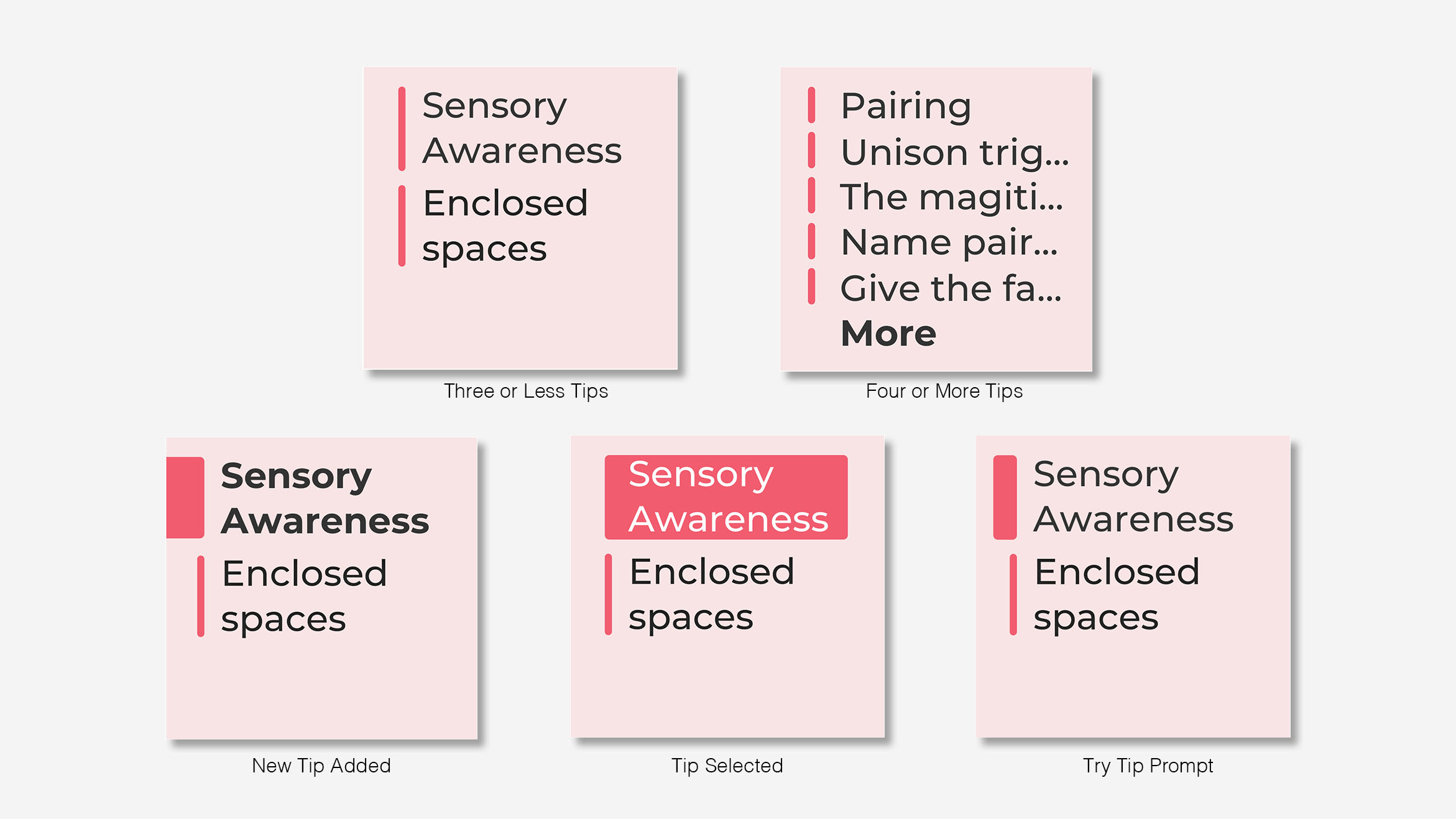
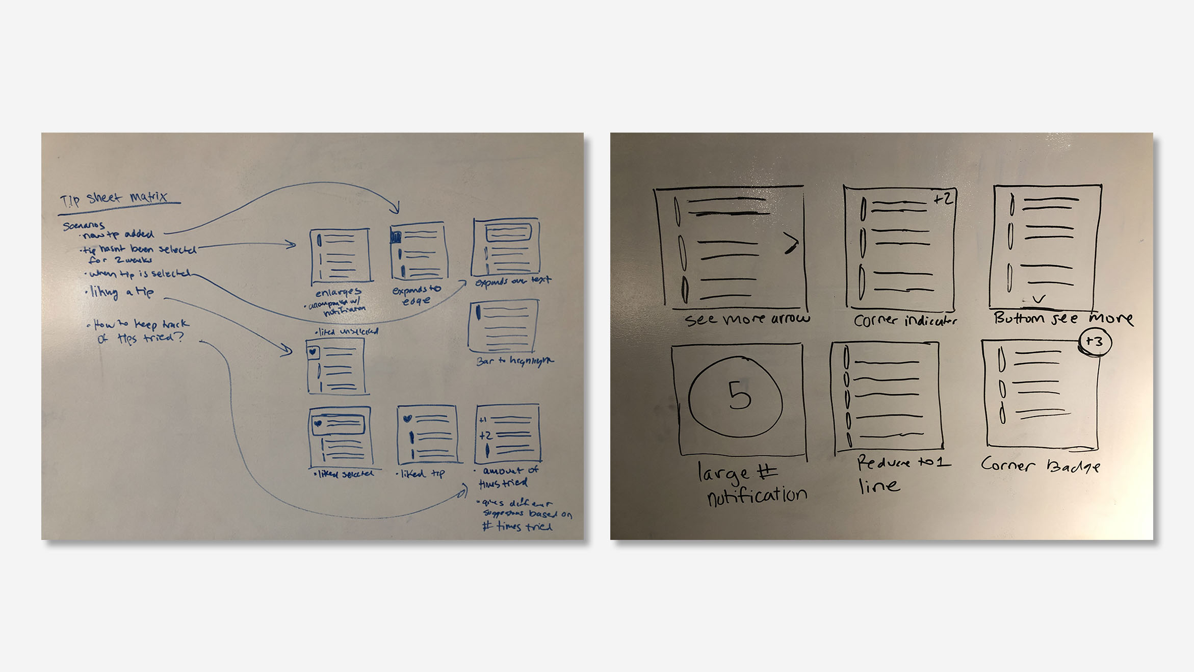
Tip interactions on the tip sheet matrix. When there are 3 or fewer tips on the tip sheet each tip occupies two lines (top left). If there are 4 or more tips each tip occupies one line (top right). When a new tip is added it is bolded and bar expands to call attention (bottom left). When a tip is selected the bar covered the text to highlight (bottom middle). A few weeks after a tip has been added the bar will expand followed by a prompt in the dynamic sidebar to ask about its success (bottom right).
Easy learning
Another requirement for providing a finished MVP product is the ability to add and remove tips from the tip sheet. Adding a tip brings up an overlay that allows someone to search or browse for tips, and mimics the e-commerce shopping experience.
These features occur on an overlay panel. This makes the AI feel less deep and more accessible to the user.
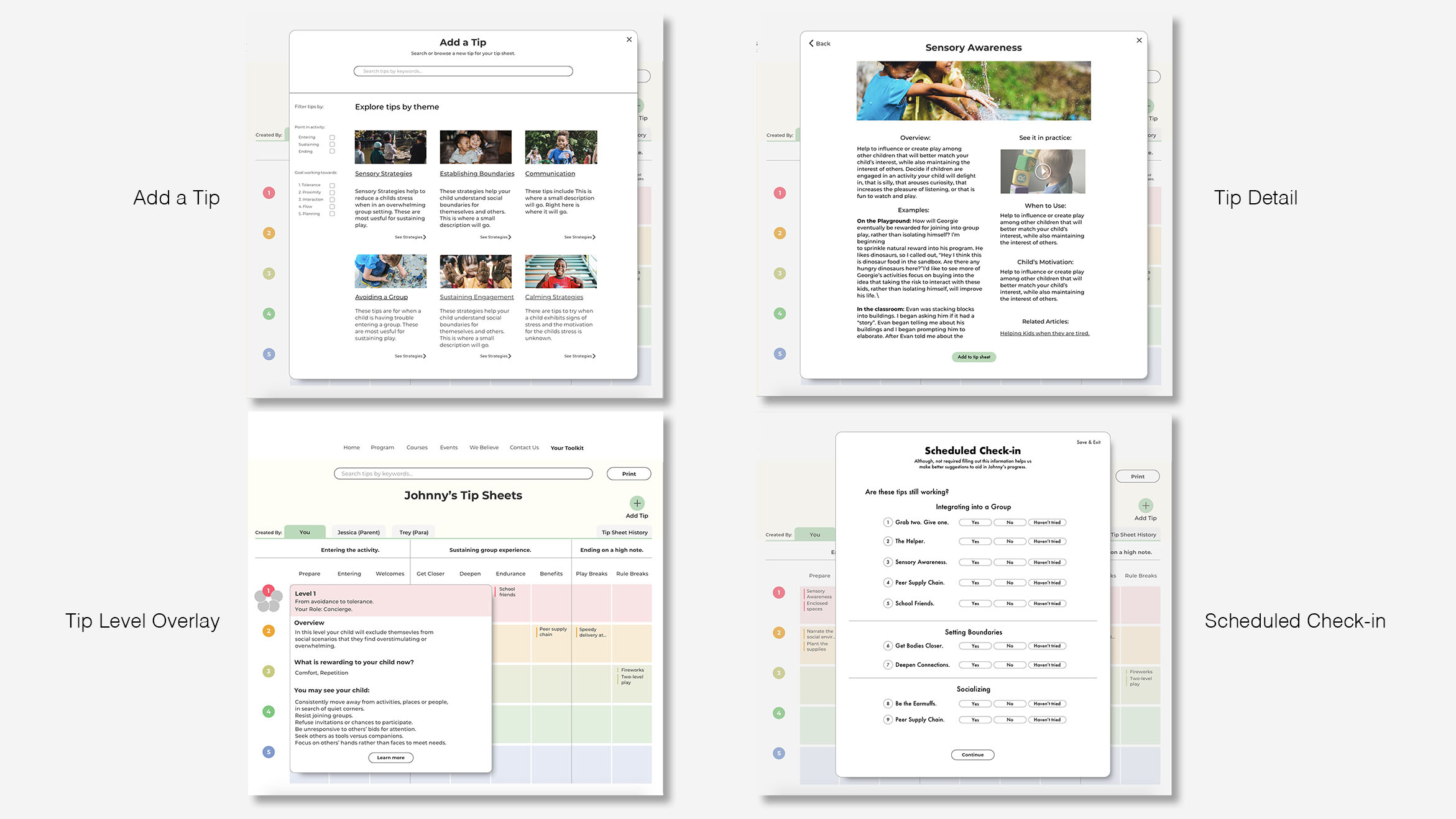
Various functional and educational overlays that appear within the tip sheet feature. Overlay that provides the ability to search and browse for new tips to add (top left). Detail tip page with add tip button (top left). Just one of several overlays on tip sheet matrix used to display relevant educational content about the tip sheet (bottom left). Scheduled check-in for bulk modification of the tips on the tip sheet (bottom right).
Continuing education
The sidebar is a design element the simple universal hub where users can manage their tips, learn about new techniques, and receive notifications. This educational sidebar answers goal 2 by providing easy access to learn about new tips, and learn the techniques through visual and written content.
The sidebar also provides help in the form of continuing education by suggesting new tips to try and new articles to read. It is also where you can learn about tips that you have added to the tip sheet as well as manage them.
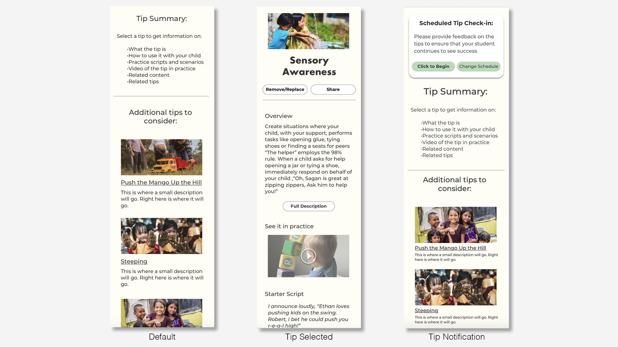
Variable states of the dynamic sidebar. The default content provides suggestions based on tips in the tip sheet (left). When a tip is selected it displays snapshot of relevant tip information (middle). Notifications related to the tip sheet matrix appear on the top left of the sidebar (right).
Style guide for future design systems
I create a style guide to assist Learning Seeds in communicating the design intent to engineers and future designers.
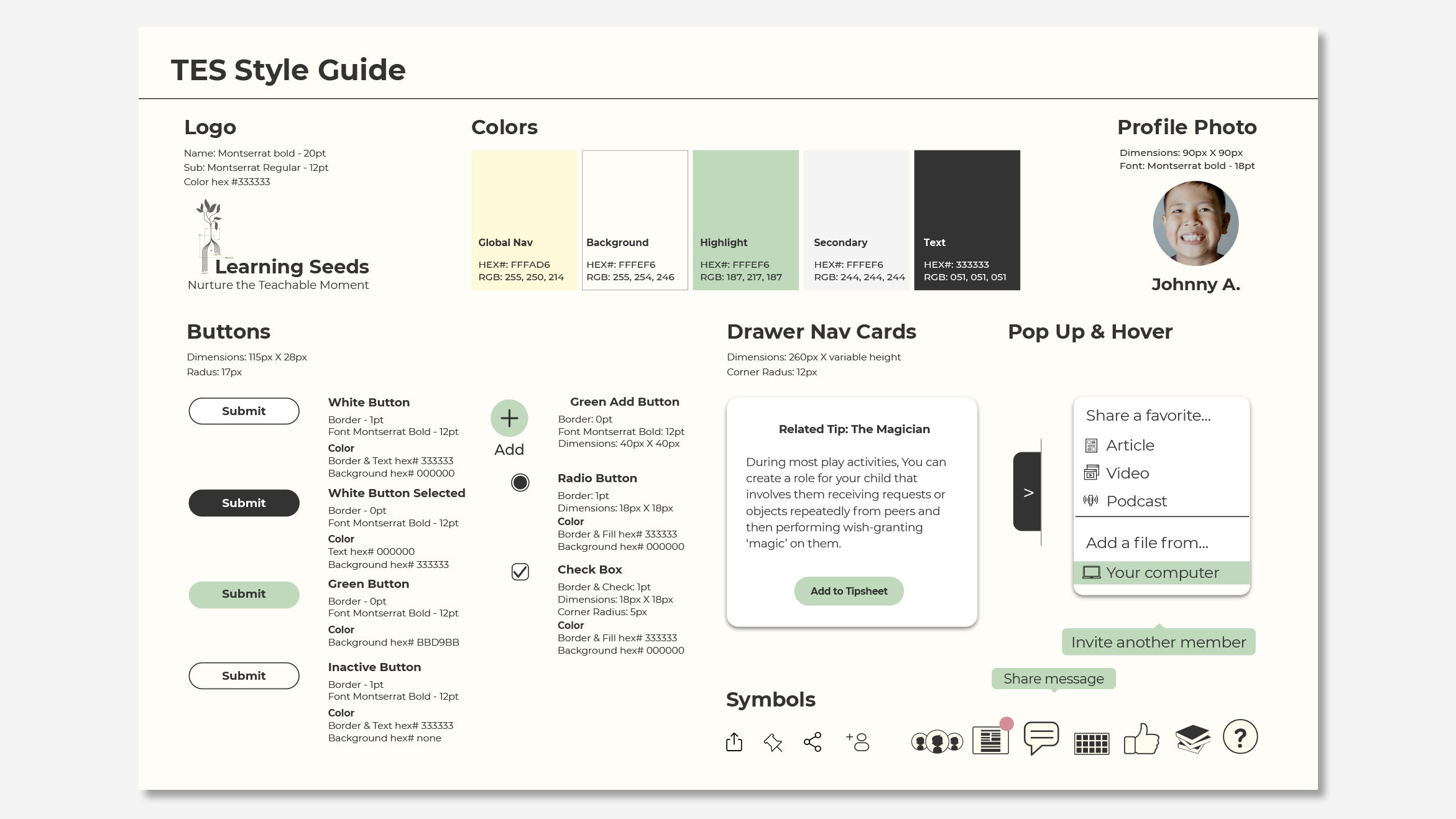
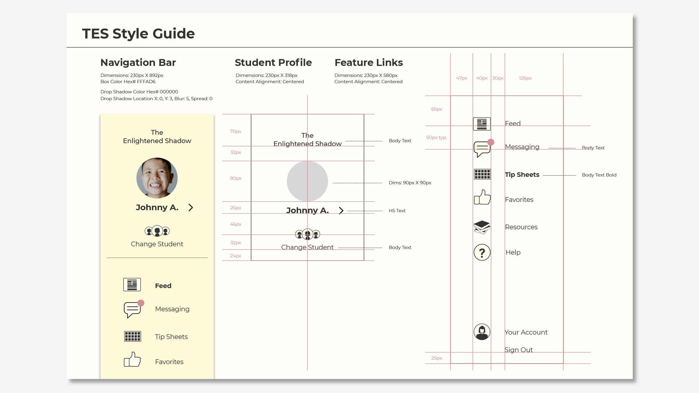
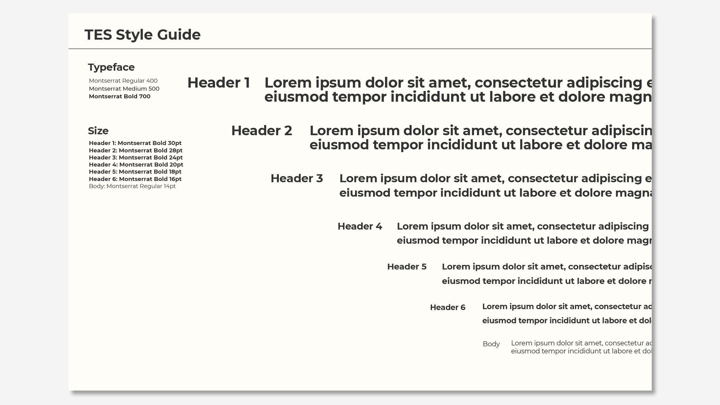
Digital style guide I made for the client in sketch.
Demo walkthrough
Below is a walkthrough I narrated explaining the elements of the Tip Sheet Feature.
Next steps
The biggest problem our team encountered was communicating the intent of the Enlightened Shadow Program. It was originally created to be used just by Erica the CEO. This has lead to a large amount of lingo and narrative in the content that is unclear and needs refinement in order to stand on its own.
Our team would continue research by doing workshops with parents to understand what content they need in order to more easily learn and implement the techniques on their own.
MORE
© 2023 Taylor Baer. All rights reserved.