KAYAK
Travel guide creation tool
Overview
I was tasked with designing a new travel guide creation tool from 0-1.
Role
I was responsible for user research, design and coordinating with marketing and engineering teams to ensure the product would be ready for public launch.
Project goal
The goal was to align Guides Proof of concept with user pain points and business needs.
User pain points and buisness goals
In order to align the product with user pain points, I performed several rounds of user testing. The main takeaways from this testing were that:
- Users found creating Guides difficult
- Users wanted to be able to Explore Guides created by others
- Users lacked incentive to create a Guide
Primary business goals are:
- Improve incentive for account sign-up
- Increase user retention through diversified content offerings
Learnings from the proof of concept
In order to understand what had been done by the previous designer, I performed a product audit see [fig 1] below. Results from the audit include:
- Responsive layout required two different designs between mobile and desktop
- Unclear what can be interacted with
- The design and UI was off-brand
- The product had a confusing hierarchy and information architecture
- Interactions detracted from experience
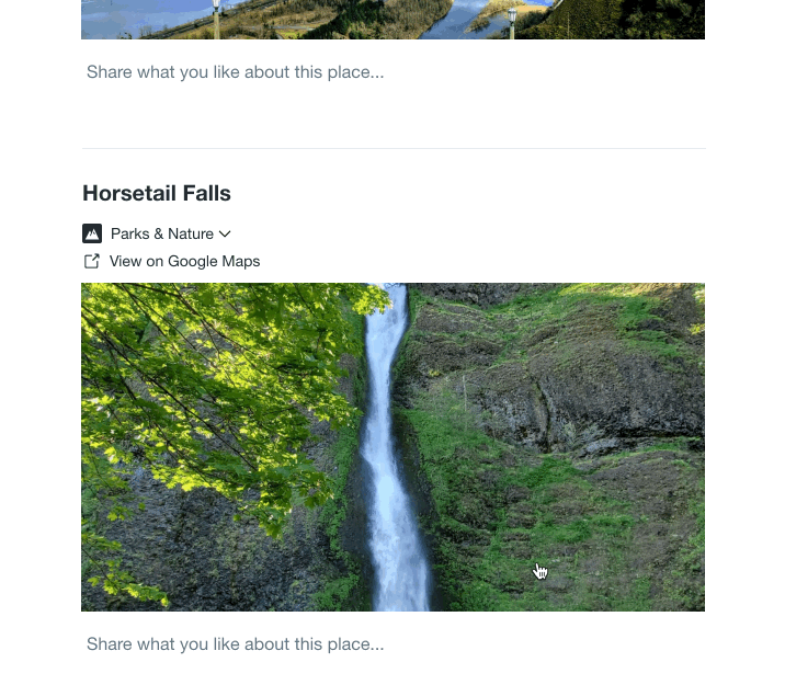
Proof of concept mocks handed down from the previous designer
Objectives to achieve the goal
We felt that by focusing on the findings from the audit and the feedback from user testing we could improve the incentive for account creation and lay the groundwork for new content offerings to increase retention. With this in mind, we created 3 primary objectives.
- Make Guide creation easy
- Help users discover new Guides
- Improve feedback and validation for creators
Objective 1: Make Guide creation easy
User problems
- Users couldn't tell where to input text or how to edit the content they added
- Users didn't understand how to create and use Sections
- Users couldn't find drag and drop and also had trouble using it
Significance
Findings from user interviews suggested users only spend 2-30 minutes putting together a list of recommendations for someone, therefore the success of the product depends on creation being as easy as possible.
Solution: Unifying UI and interactions
Due to the short time constraints, my team and I tacked the problems by focusing on 3 themes: aggregating similar functionality, improving visual hierarchy, and using iconography and interactions that would be familiar to the user. We used these themes to answer the noted user problems and fix problems from the product audit.
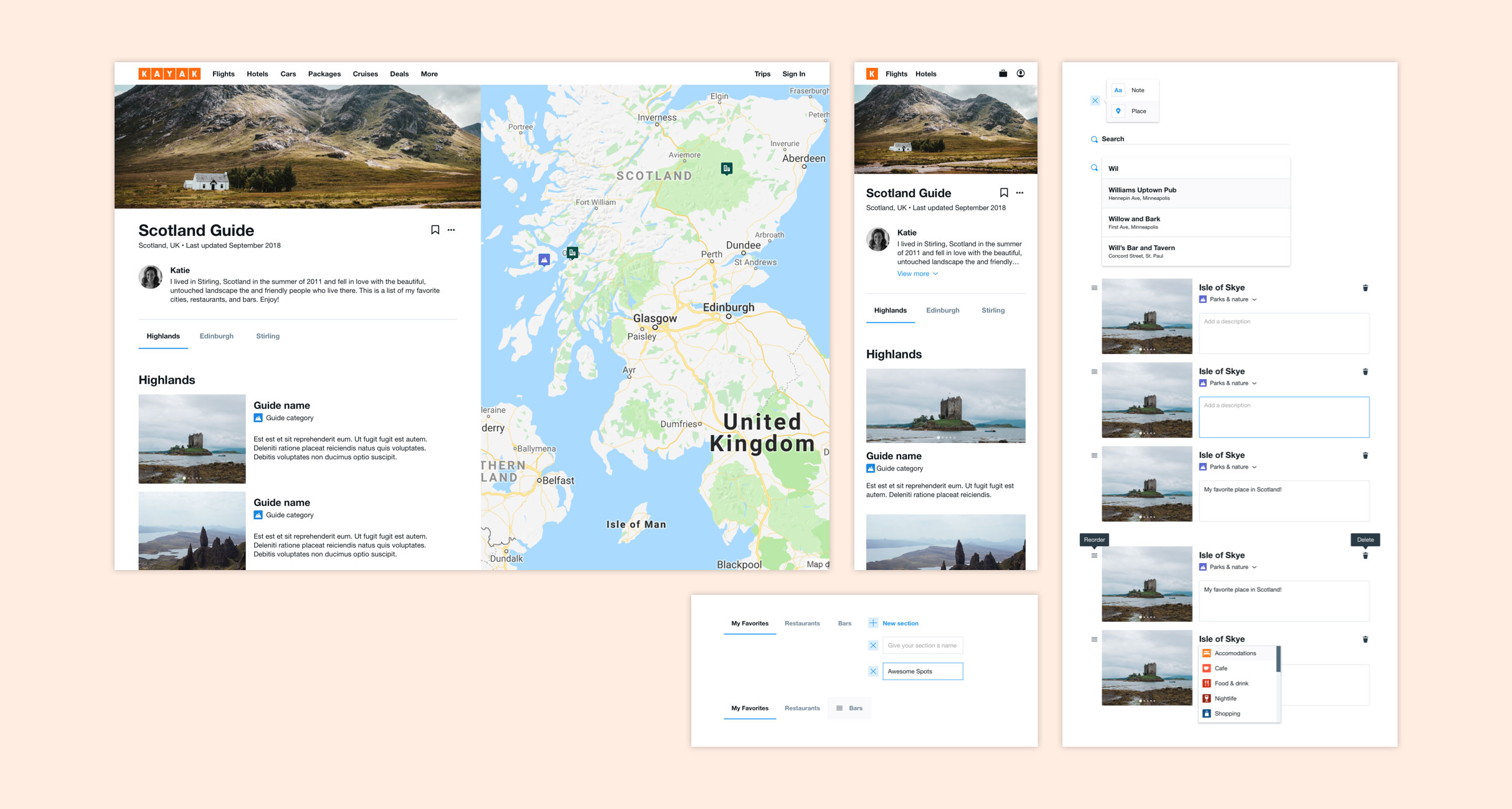
Users were confused on what areas could be interacted with a where content could be added. This was due to different interactions for each type of inline content, section, note, and place. To address this we unified all text editing interactions and aligned content vertically to allow all text to be full width.
(Left) Mock of new input highlights, drag handle, and layout. (Right top - bottom) new inline add highlight, add buttons, note with 'save' notification, recommendation card
Solution: Exposing sections
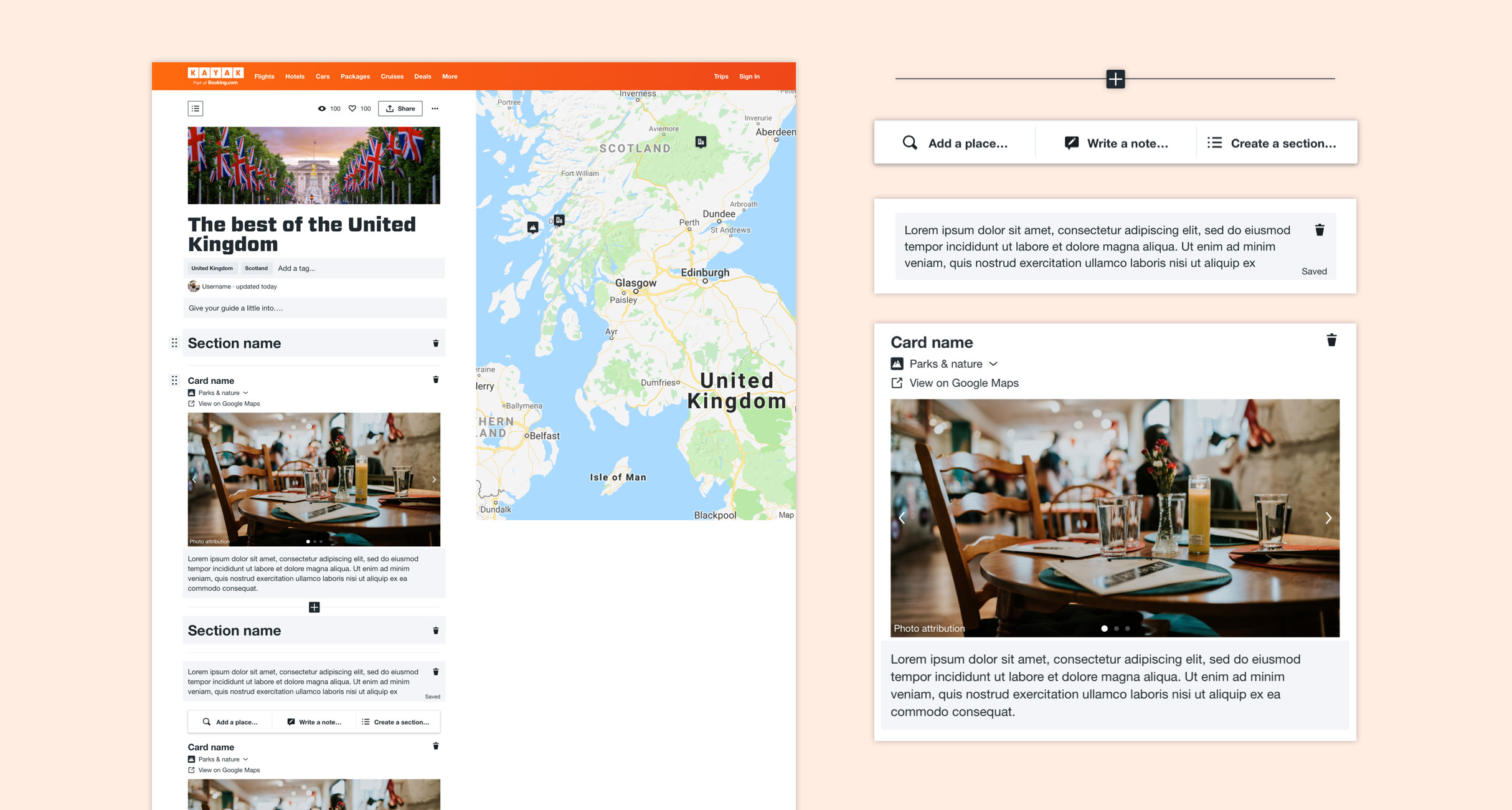
User testing suggested 2 reason users were didn't understand what Sections do or how to create them. (1) Adding Sections to the Guide wasn't consistent with the other inline adding interactions and (2) Sections were represented as a horizontal tab UI when inline content is arranged vertically. To mitigate these issues and simplify the experience we aggregated all inline adding functionality and created new vertically aligned Section navigation.
New section interaction in the top navigation and left rail
Solution: Improving drag and drop visability and usability
Users were struggling with finding the drag and drop handle and while using it they couldn't tell where the item was being placed. To improve this interaction we changed the icon to 6 dot handle, increased the width of the margins on the content to give more breathing room, minimized card on drag and drop, and enlarged the area where item could be placed.
New drag and drop interaction found used in Creation Mode
Objective 2: Make Guides discoverable
User problems
- Users have no way to see Guides others have created
- Users' lack the incentive to create a Guide for peer to peer sharing but consistently expressed a desire to share with a wider audience
Significance
The initial value prop (peer to peer sharing) was not aligned with user motivation, therefore it was not meeting a real user need.
Solution: Improving visibility on the site
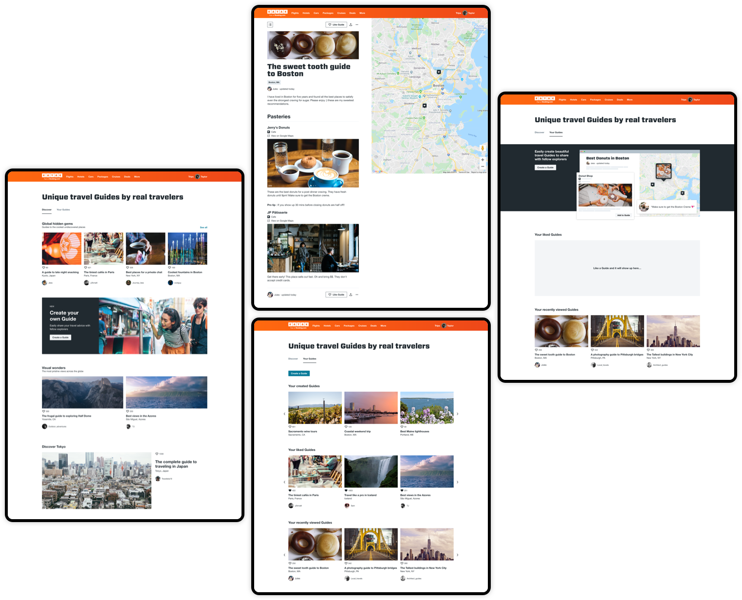
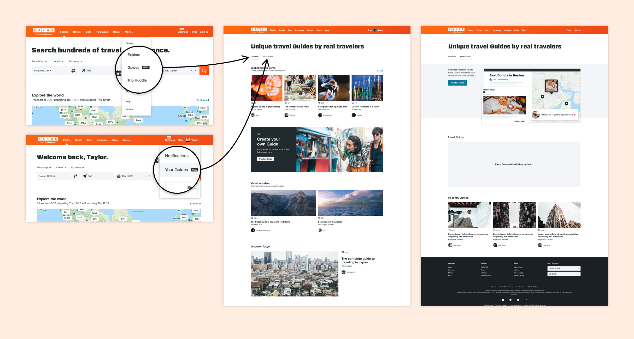
Based on user feedback we decided to align the value prop with the user's desires to share with a wider audience. This led us to create a brand new discovery vertical where Guides could be explored.
During user testing, most users expressed a desire to see other created Guides. Although not part of the original value prop, we pivoted to give Guides more visibility on the site and create a way for non-logged in users to view content. We explored various methods and touchpoints for Guides throughout the site.
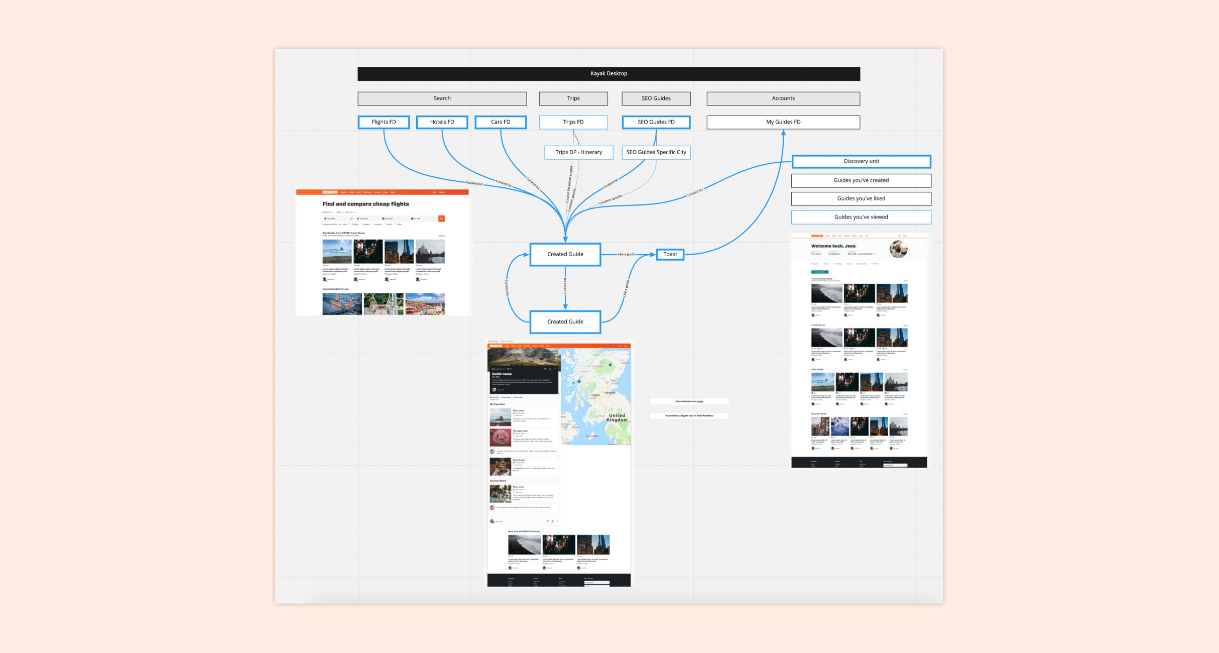
Flow chart to document potential integration and touch points on desktop
We settled on a simple IA that moved Guides out of Accounts into one section. It can be accessed from the more and accounts dropdown.
Final touchpoints and IA of Guides product
Objective 3: Improving validation for creators
User problems
Users lack incentive to create Guides due to an inability to see the impact of their work
Significance
People want to know their work is helping others and that it is being seen. By meeting these needs we will be improving the incentive for users to create Guides.
Solution: Visual validation, exposing like and view counts
Our V1 solution was to display 'like' and 'view' counts to the owner of the Guide. This allows users to see how much engagement their Guide is receiving, giving them some validations for their work.
We found that users were less motivated by peer to peer Guide creation. They were interested in sharing their work with a larger audience. They also wanted to see that their work was getting engagment. We exposed like and view counts to users so they can measure engagment and receive validation for their work.
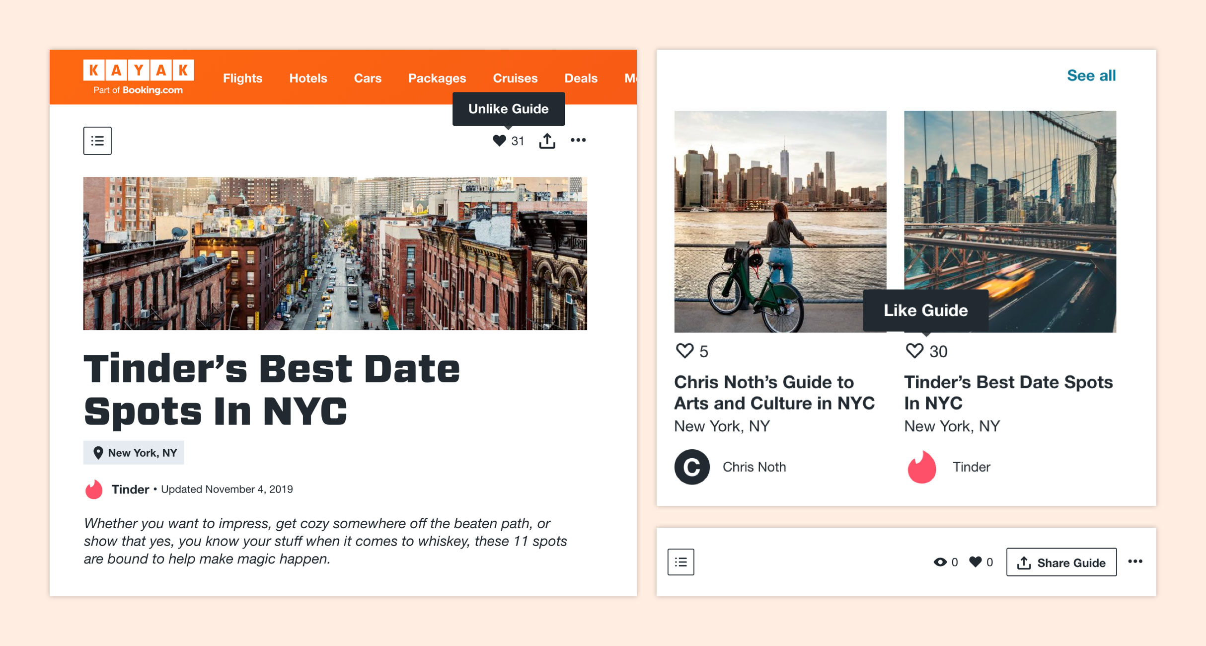
Like counts when viewing another creators Guide (left). Like count when browsing Guides (top right). Like and view count of owned guide (bottom right).
Results: Over 7k Guides and counting
What I learned
When creating a new product validate assumptions with real users early to ensure new product positioning aligns with user needs and pain points.
Establish a common language and goals around the product by creating strategy documentation early in the project.
Next steps
- Set up XP console to measure the impact of new features on engagement
- improve connection fo Guides to other parts of the product - search and trips
- Add search to Guides discovery
- Explore Guides potential as a trip planning tool
Press
MORE
© 2023 Taylor Baer. All rights reserved.