
Inman Square Hardware
E-commerce site
E-commerce site for a local hardware store
Overview
Inman Square Hardware is a small family-owned store that serves the Somerville and Cambridge areas of Massachusetts. They currently have no way for customers to shop and order online, limiting their ability to compete with other hardware businesses. They are looking to expand their website to include e-commerce to offer a more competitive shopping experience.
By the end of the sprint, I had a working clickable prototype that allows users to browse and purchase items online.
Role
I was tasked with researching and ideating on the potential functionality of this new feature.
Project brief
Inman Square Hardware is looking to improve its customer's shopping experience by creating a way for them to shop online.
Research goals
- Understand the target user's pain points in regards to shopping for hardware online
- Understand how the target user categorizes Inman inventory
- Learn the typical UI paradigm of the hardware e-commerce experience
User interviews
My first challenge was understanding the target users pain points. I interviewed six people, who shop at the hardware store more than 6 times a year. During the 10 minute interview, we discussed difficulties around shopping in person vs online for hardware and what their methods are for shopping at a hardware store.


Key takeaways
- I want to avoid making costly mistakes
- I don't want to waste time because I didn't' know what I needed to do the job
- I ask for advice from people I trust
- I consult the hardware store website to avoid wasting time in the store
- I find doing something for the first time to be overwhelming
On-site inventory audit
The next challenge was to develop logical information architecture to create a browsing experience that will save time by making items easy to find. I performed an inventory audit to by collecting 100 items that represent the breadth of the store's inventory. I then performed 5 open card sorts both in-person and online with my target user.
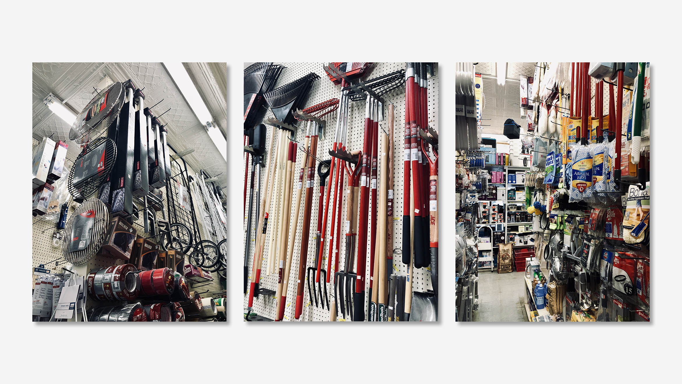
Photos from the store inventory audit.
Card sorting
Categories emerged. I selected the six categories that had the most overlap to perform a series of closed card sorts. Most of the items could be organized into the 6 categories except for a few which could fit under the home accessories category.
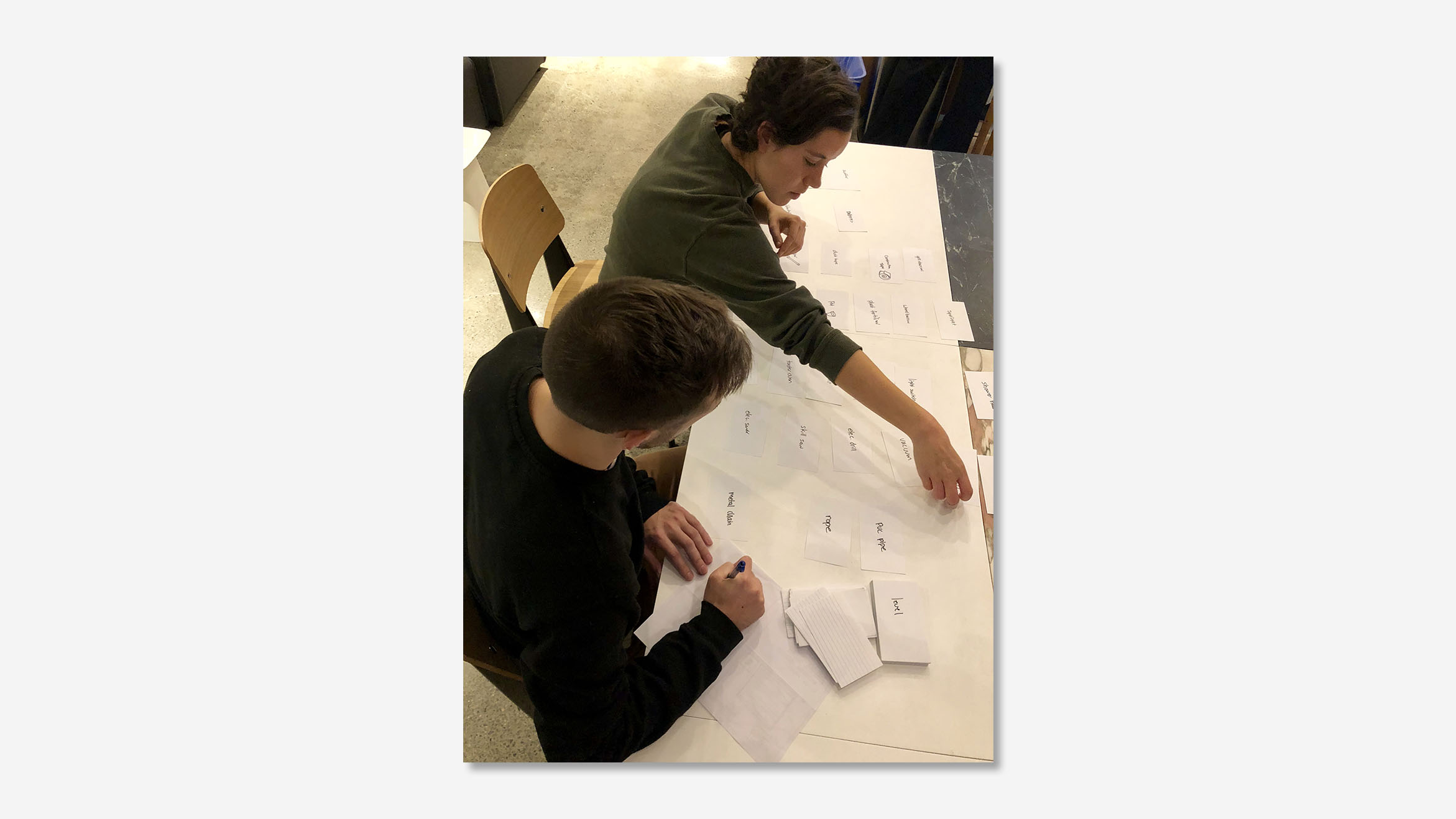
Performing an open card sort with a user.
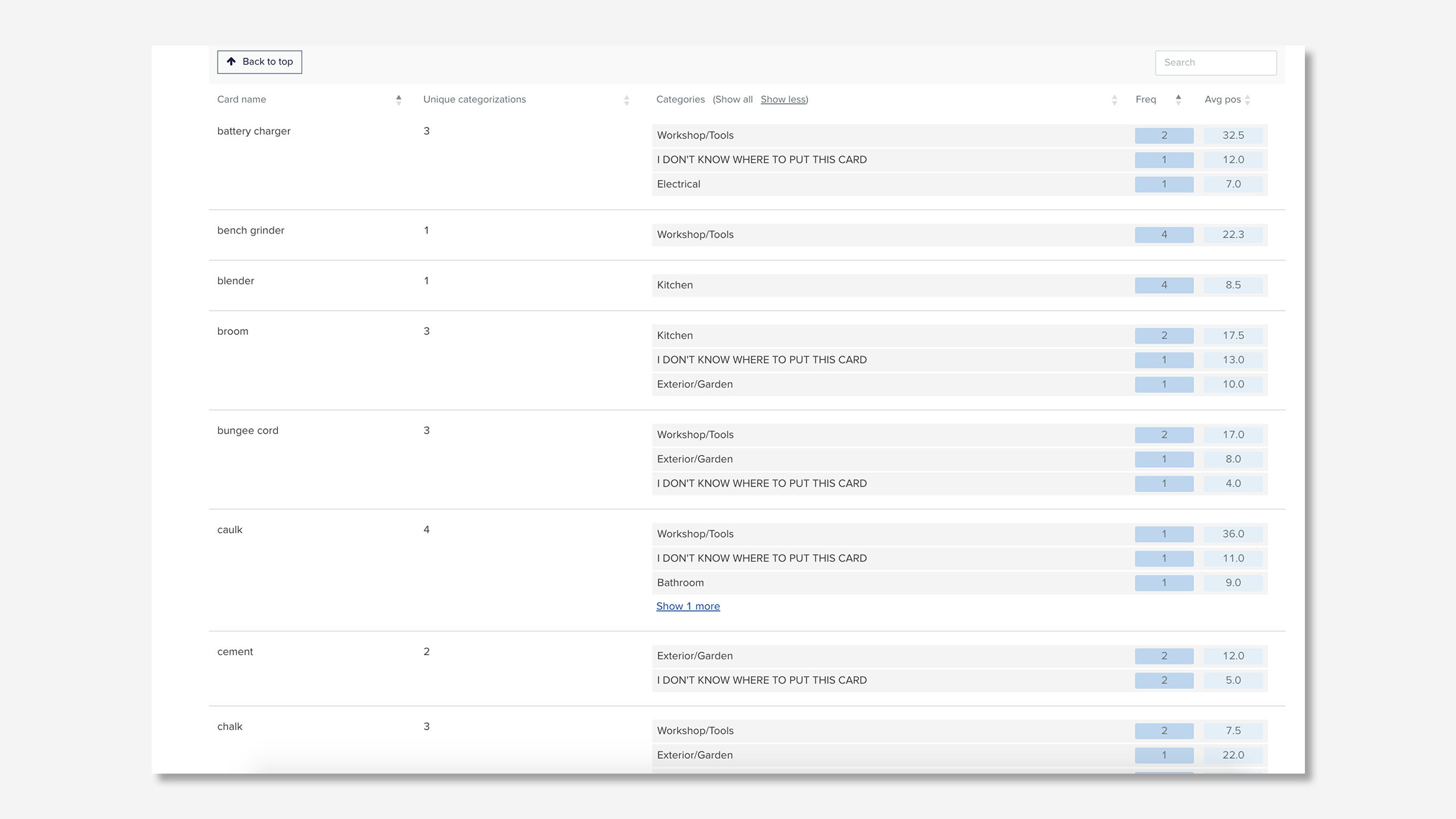
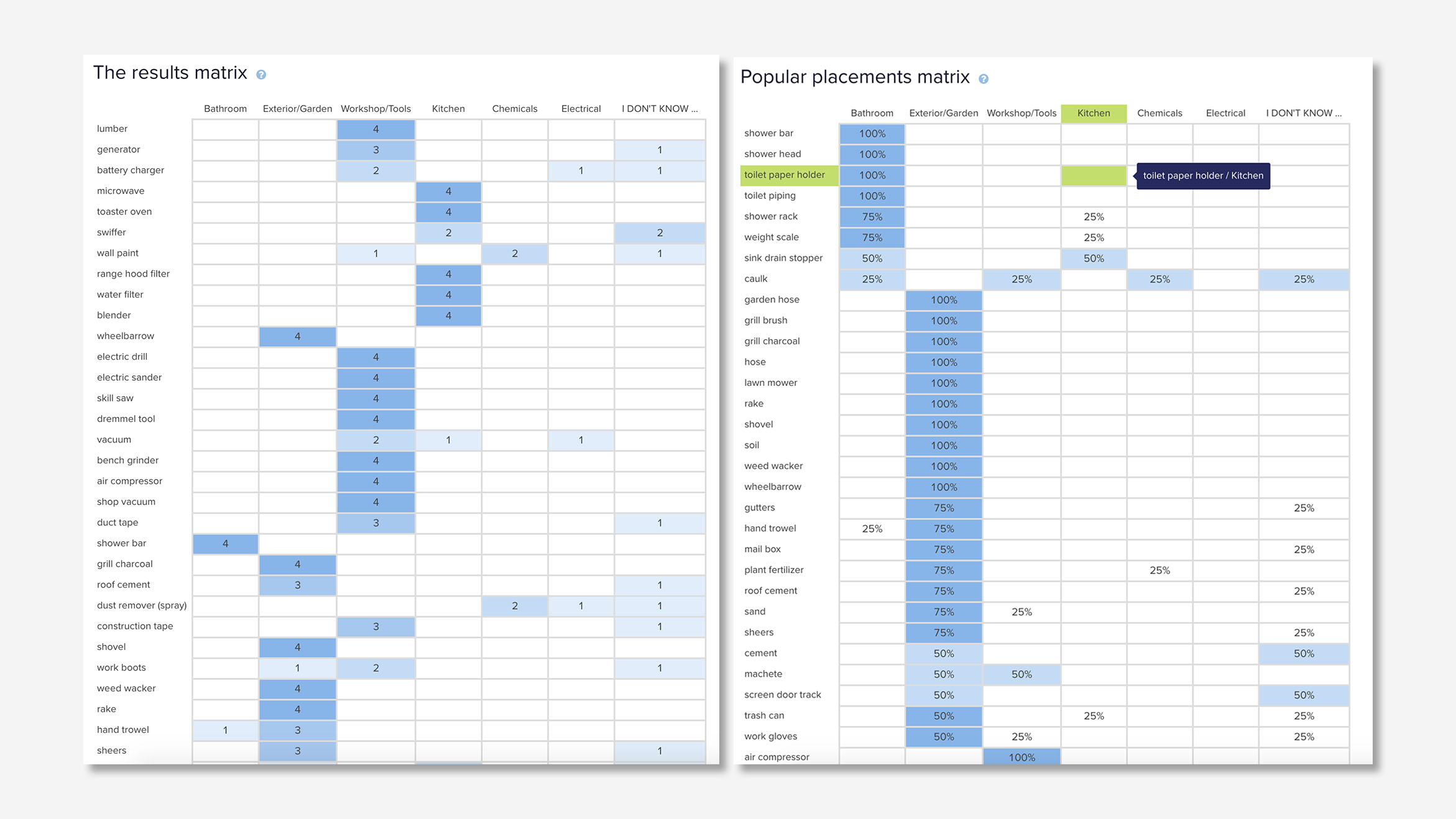
Image 1, results from the closed card sort. Placement location by word, image 2 number of users who placed an item in a category (left), the percentage of users who placed an item in a category (right).
Site map
The categories (seen below) in the sitemap are general enough to adapt to a growing inventory yes specific enough to assist people in finding their desired item. It was a priority to keep the item detail page from being greater than three clicks deep. The performance of these categories was examined during usability tests.
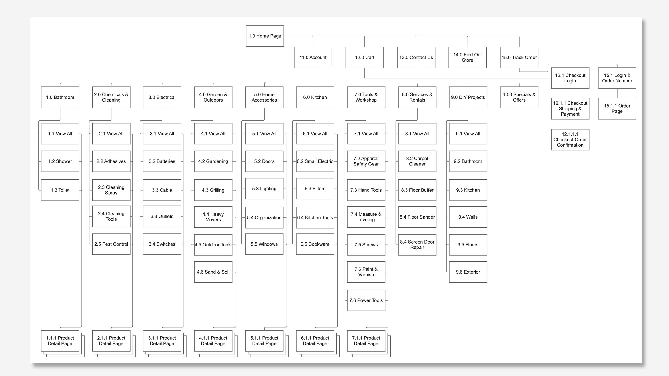
Sitemap including all card sort categories 1.0 Bathroom - 7.0 Tools & Workshop.
Evaluating e-commerce design patterns
Because shopping for hardware can be stressful it was important to provide a familiar experience that doesn't require the user to learn something new. To better understand the typical experience offered by e-commerce sites of brick and mortar stores, I performed a heuristics analysis and a competitive audit of several competing national chains.
I found that most successful sites reduce visual clutter and cognitive load by streamlining the global navigation with icons that contain large groups of hidden links.
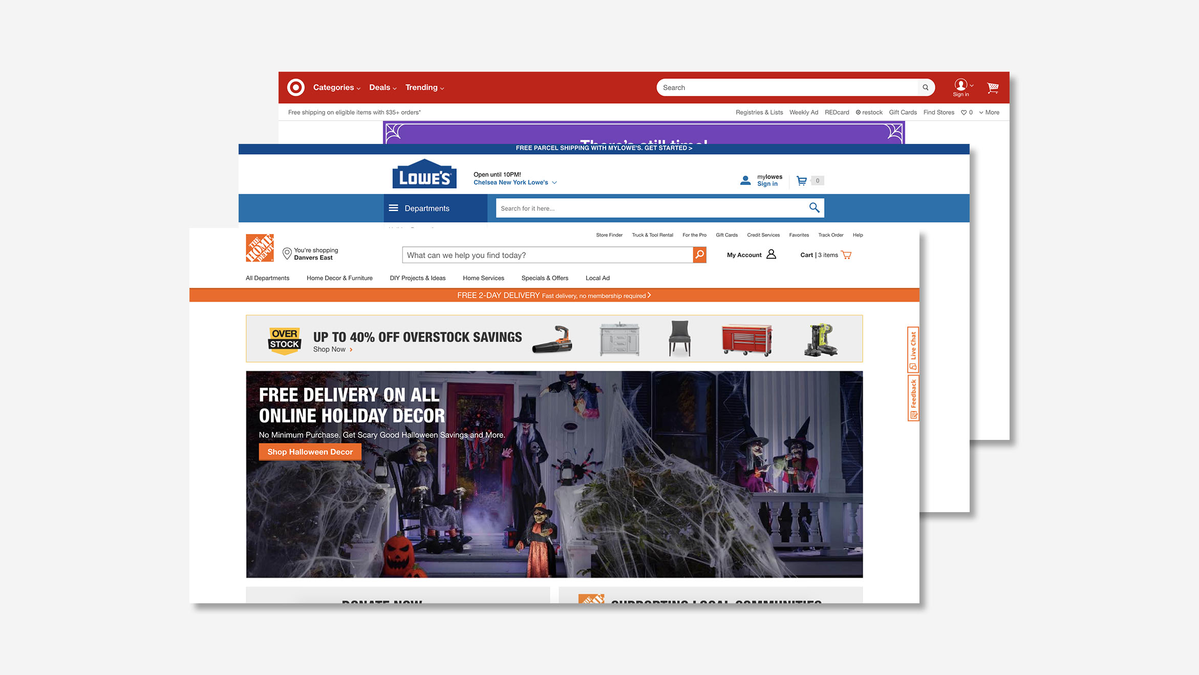
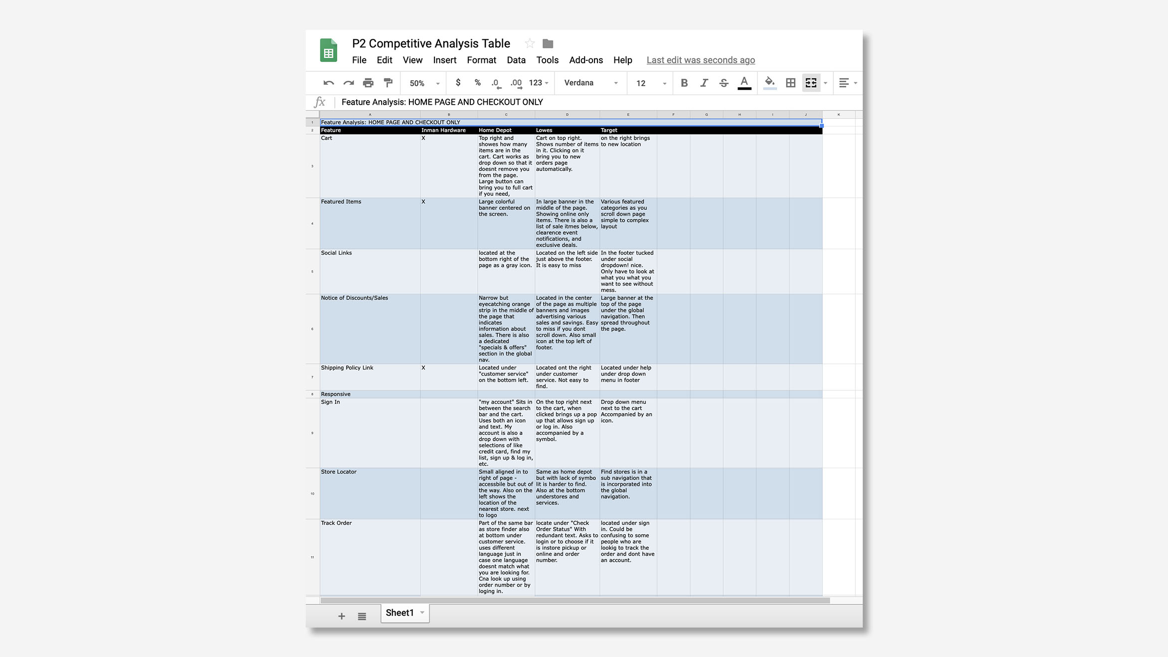
Competitive analysis, home depot, lowes, and target e-commerce websites (image 1). Heuristic analysis matrix created for competitive analysis (image 2).
Task flows
I then created several users flows based on the findings from the competitive audit. These flows provide a complete experience from finding an item through browsing to checkout and order status.
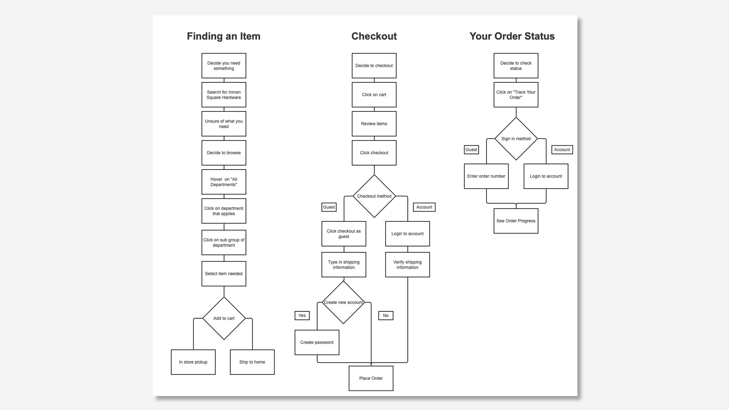
Axure drawing of user flows. They were used to achieve an MVP product.
Designing a complete shopping experience
The user flows informed what sketches would be necessary to complete the task of find and purchasing an item. I refined the sketches and performed several in-person usability tests to work out major structural issues with the flow.
Major design goals include:
- Simple and easy browsing for quick decision making
- Provide educational support to mitigate costly mistakes
- Provide a way to ask for advice from professionals
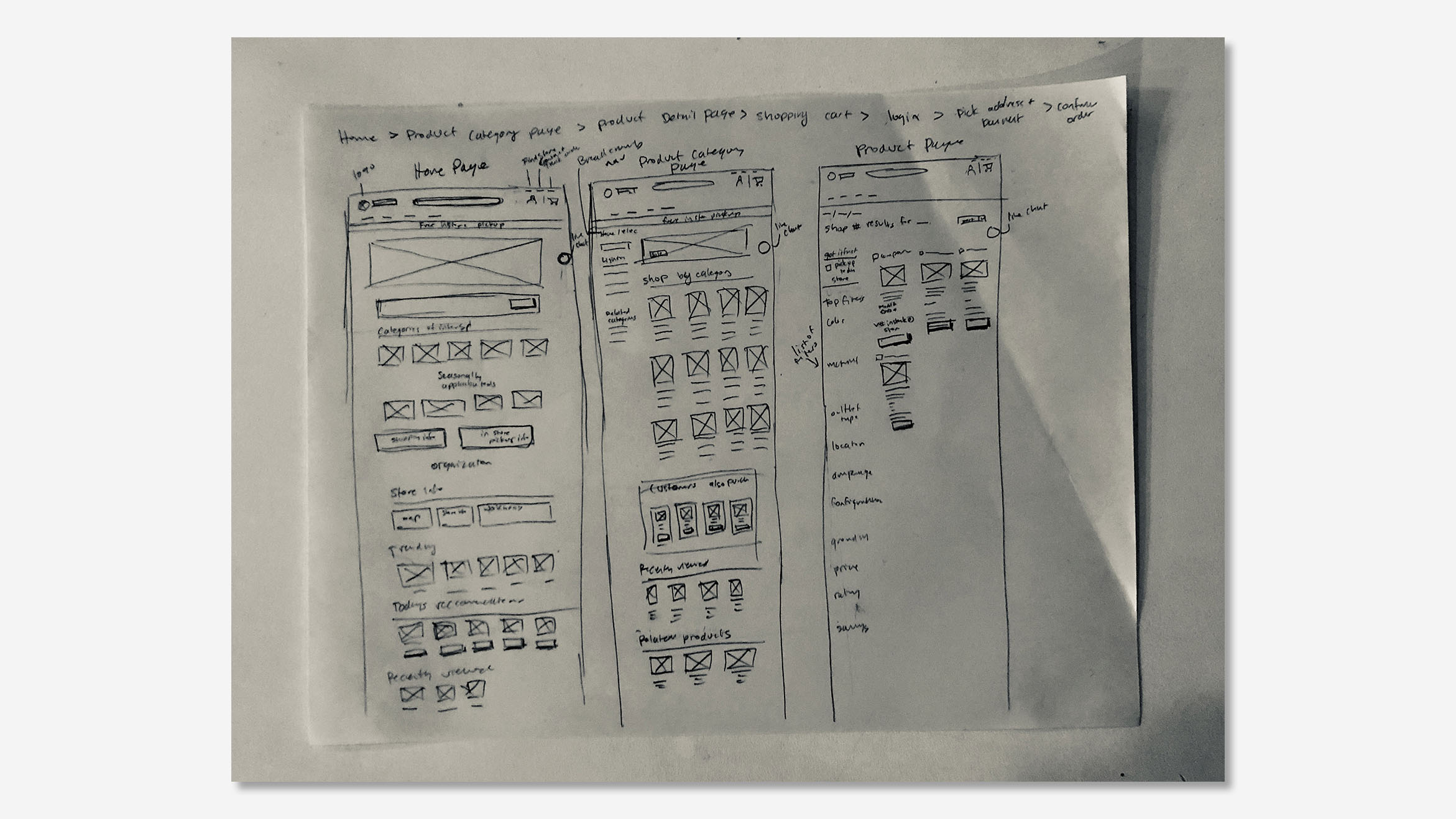

Preliminary sketches of screens.
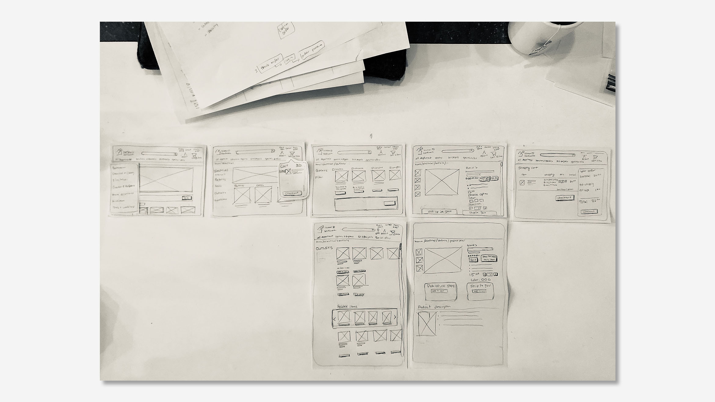
Refined sketches used for paper prototype usability tests.
Wireframing for testing
After paper prototyping I constructed the wireframes in Axure for continued usability tests.
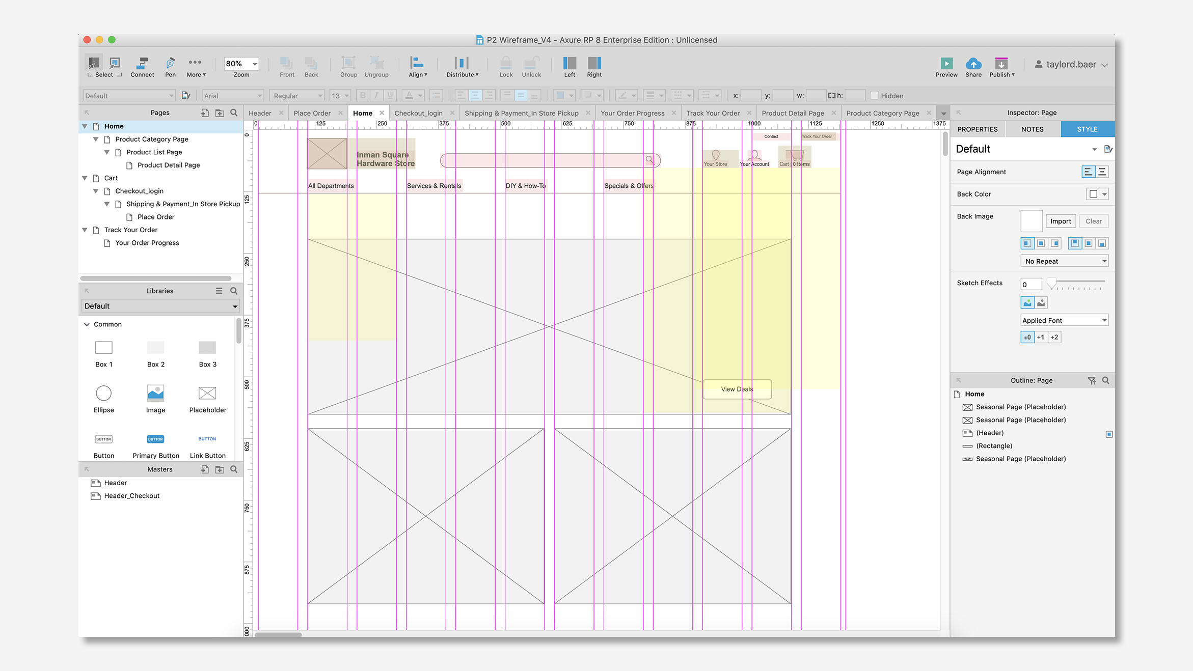
Axure wireframe of home page.
Product detail page
In response to the user wanting to avoid making costly mistakes, I added several sections that provide detailed information on how to install the item and what they should be looking for to ensure they are making the correct purchase.
The "learn how to install this item" at the top of the page brings users down to the sections 'things you might need to install this item' and 'how to install this item'. These sections provide the products and tools needed to install and video tutorials on how to install. The section "how to know you are buying the right thing" provides tips on what the user should be looking for in their home and product to ensure they are purchasing something that will work correctly.
The most significant iterations include:
- Changing the language of categories to be more descriptive
- Changing the location and proportion of 'Q&A' and 'learn how to install' buttons
- Detail and info copy
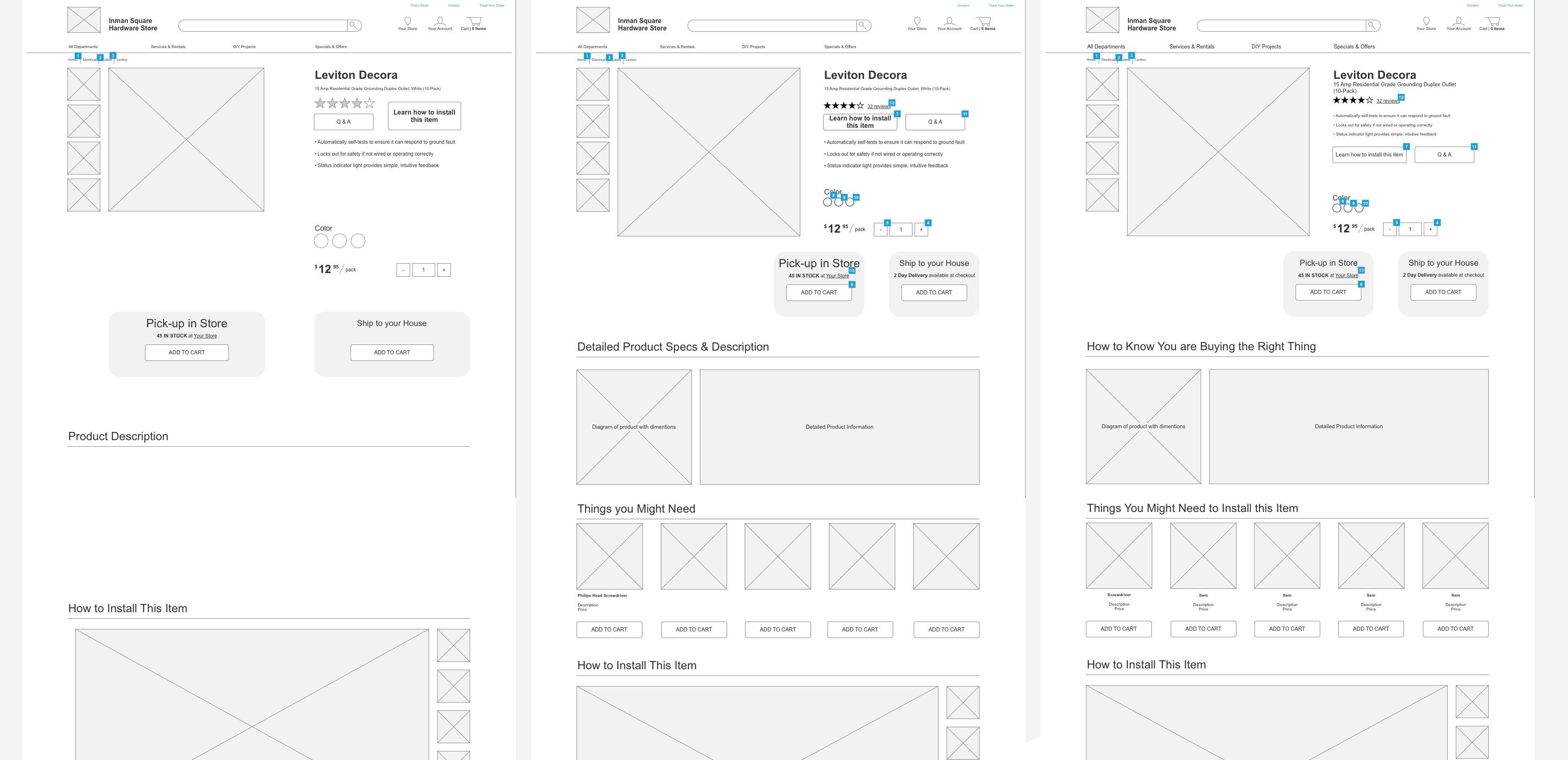
Iterations of the product detail page, V1 (left), V2 (middle), V4 (right).
Shopping cart page
Based on the interviews it is likely that the user will shop online but pick-up their items in-store. To address these needs I added an estimated pickup time and displayed the in-store pickup on top of the shipping section.
The most significant iterations include:
- Changed location of continue shopping button
- Added estimated pickup time messaging
- Made location of 'Save for later and 'Delete' buttons more visible
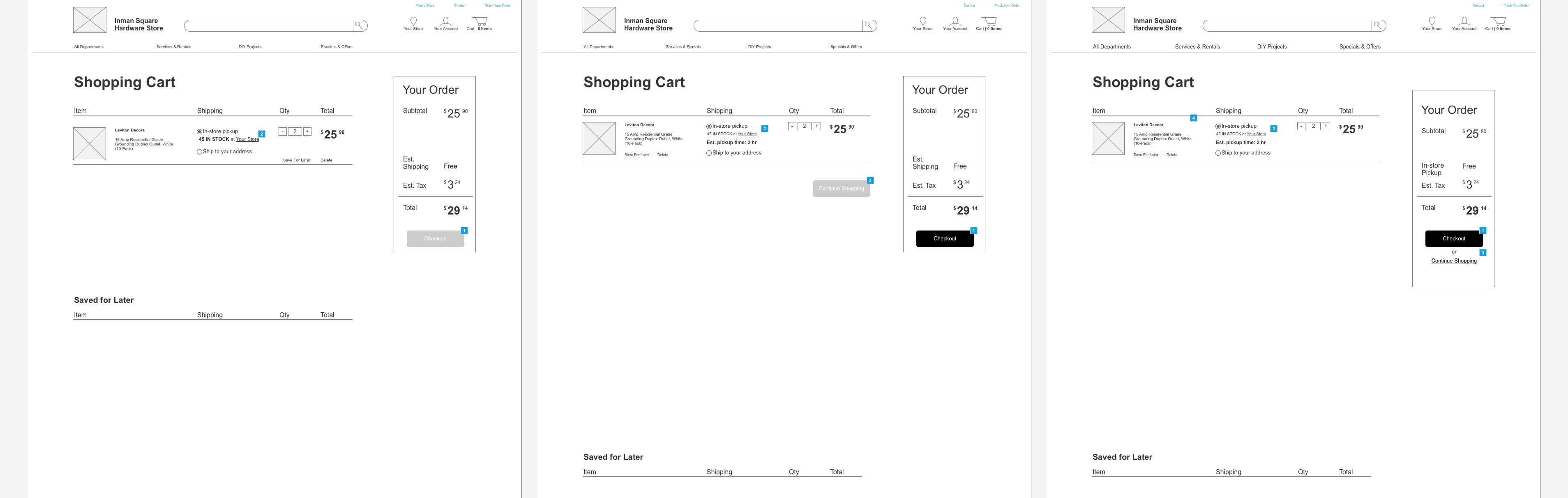
Iterations of the shopping cart page, V1 (left), V3 (middle), V4 (right).
Product list page
To speed up the process of finding and ordering the correct item when browsing, I included relevant information like reviews, short detail, cost, and quantity in stock. I also included a more detail dropdown which would provide specs and other relevant information for a more comprehensive browsing experience.
The most significant changes include:
- Added ratings and number of reviews
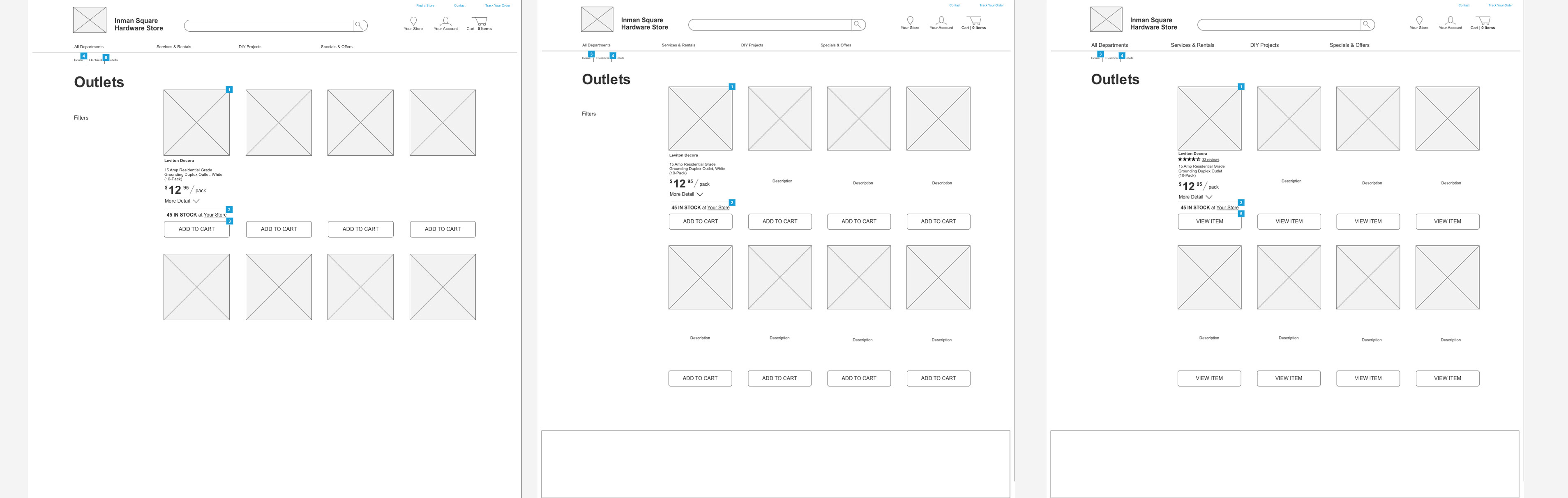
Iterations of the product list page, V1 (left), V3 (middle), V4 (right).
Axure prototype
Next steps
I would like to look into adding a feature that allows users to book a consultation with a hardware employee when purchasing items for a project. This would also include a way to describe what project you are trying to accomplish, and a way to send pictures to the consultant before picking up their stuff.
This personalized time with an expert will help the individual learn and ensure that they are purchasing the right hardware to complete the project.
MORE
© 2023 Taylor Baer. All rights reserved.