
Venmo
Donation feature
Creating an easy way for people to donate and fundraise in Venmo
Overview
Venmo is the leading mobile payment service in the United States. It handled $12 billion in transactions in the first quarter of 2018. Venmo being at the top their market is looking to expand its functionality to make a difference in the world by introducing a way for users to send money via their app to causes they care about.
I worked with two other UX designers to design a concept for the Venmo donation feature. By the end of the sprint, we had come up with a working clickable high fidelity prototype that allows users to donate to a friends cause, donate to an organization’s cause, or start their own cause.
Role
Because of my previous experience on design teams, I took on the role of the project manager. I maintained internal deadlines and guided group discussion. I performed user research, as well as ideated and tested the 'donation to a cause' user flow. I also created the templates for the team's UI in Sketch.
TL;DR
Project brief
Venmo is looking to make a difference in the world by introducing a way for users to send money via their app to causes they care about.
Research goals
As a group, we decide that our research priorities would include:
- Understand Venmo's design standards & brand identity
- Understand typical offerings of current fundraising platforms
- Discover a target user and learn their pain points around donation
Our first step was to understand the typical experiences provided by platforms like Facebook Fundraising and Go Fund Me. By doing a competitive feature analysis we found that the fundraising thermometer and the ability to share fundraising pages are standard features offered by the competition. We also discovered that a majority of the competitors are not tied directly to a money transfer system which gives Venmo a competitive advantage.
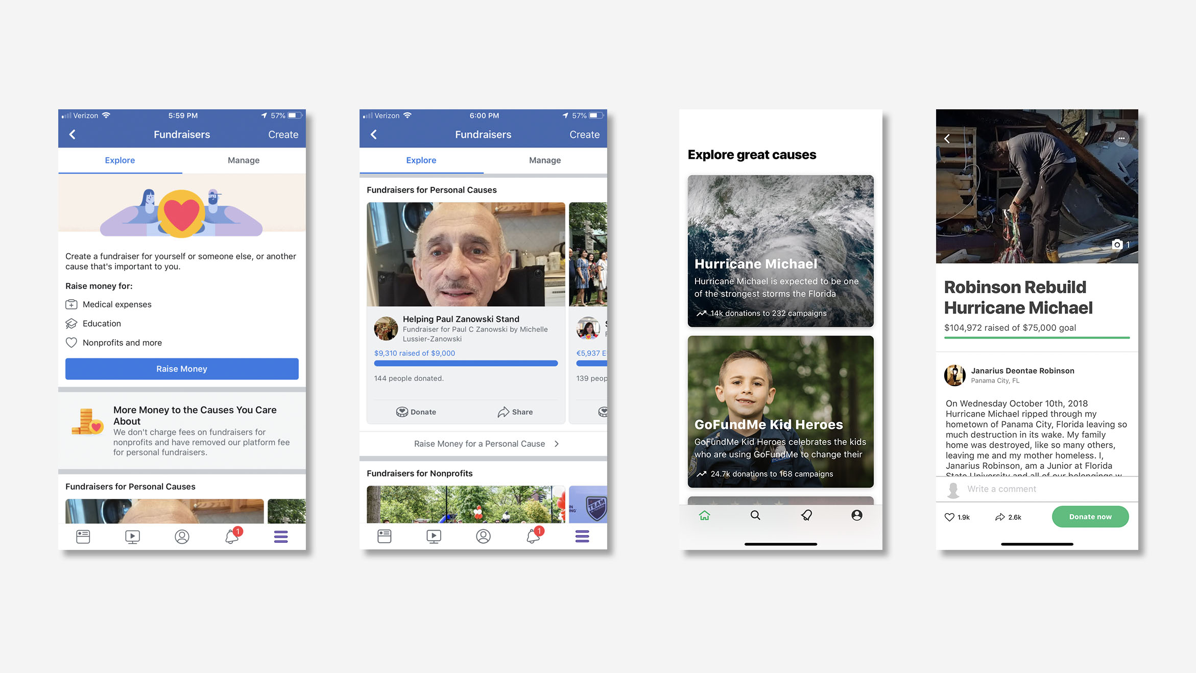
The two major competitors from our competitive analysis are Facebook Fundraisers (left), and Go Fund Me (right).
Uncovering a problem
Our next challenge was to discover who our user is and develop empathy for their pain points. To uncover this information we performed six fifteen-minute user interviews of people who were selected by how frequently they donated in the past year. Our topics of discussion were how people use Venmo, how people donate to causes, and their pain points around donating.
We found that people respond to different methods of donation. Some people want to set a donation schedule and others feel motivated by a time-based cause, but all people wanted to feel like their contributions were making a difference. We also found that most people had trouble donating and have decided to not donate to an organization because it was too difficult.
"My friends never carry cash and asking them to donate on Venmo rather than another donation site would have been less of a hassle."
"I have actually stopped donation to places because I got logged out and the online sign-in was too hard to figure out."
Key insights
- I donate because I want to make a difference
- I want donating to be less of a hassle
- I am private about my spending
- I want to know where my money is going
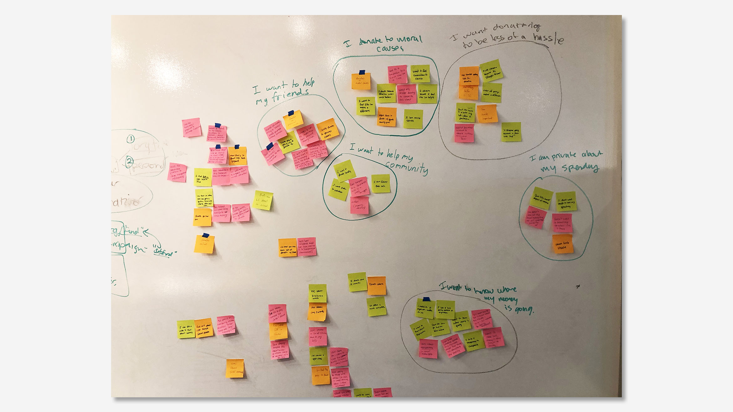
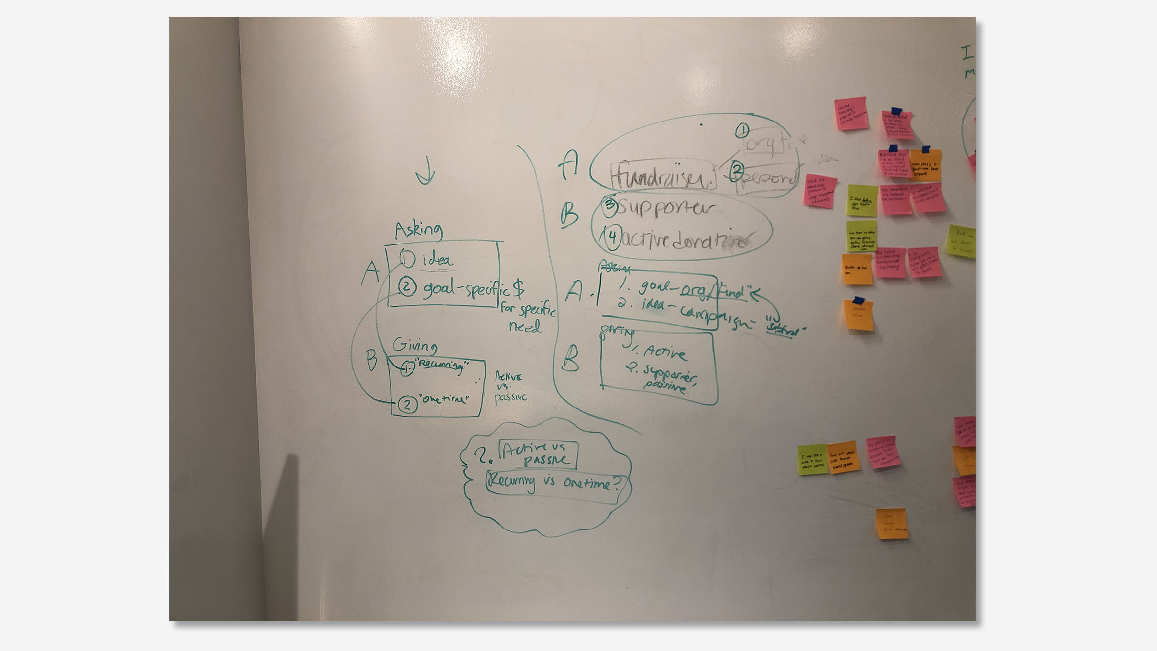
Affinity mapping (image 1) and resulting target users (image 2).
Proto-Persona
We uncovered two distinct user behaviors during our affinity mapping. There are people who donate and people who fundraise and many times these are the same person. Because we interviewed separately we needed a way to create common ground amongst the team, we decided the most effective method to represent our target users was to create two proto-personas.
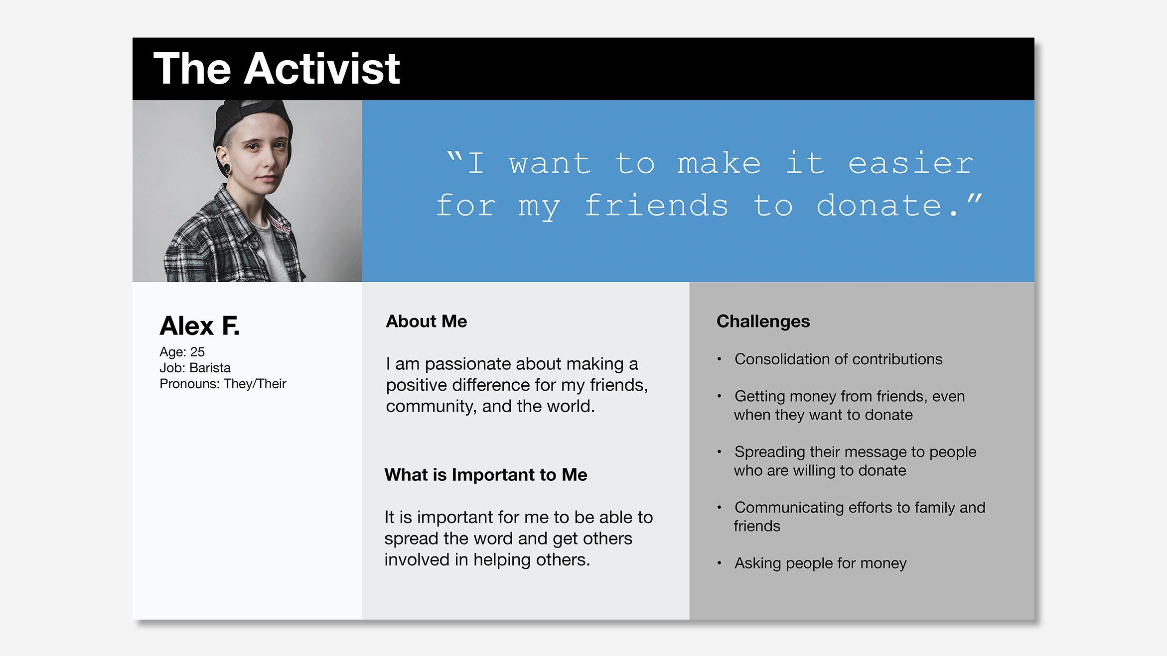
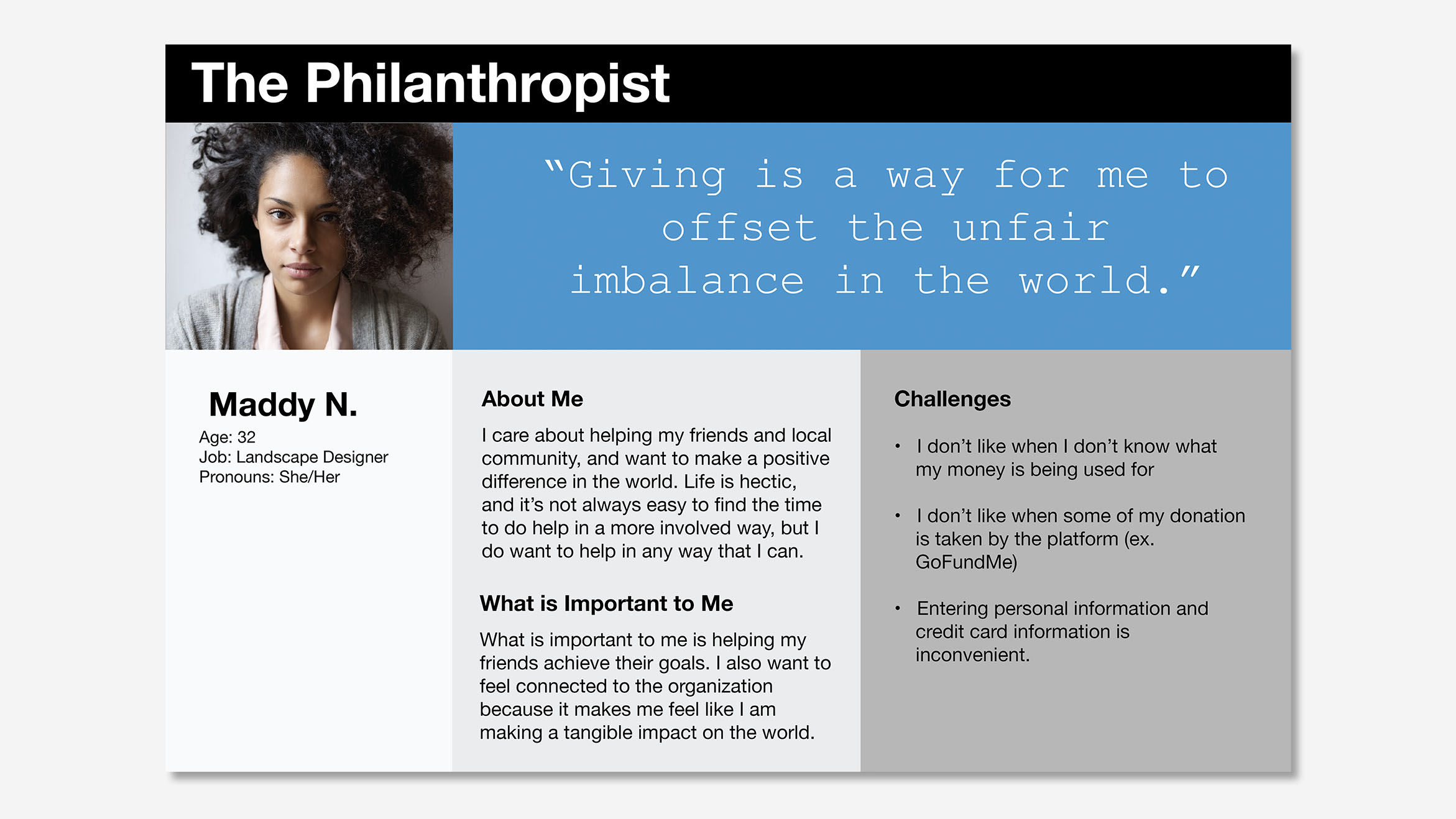
Proto-persona of the person who fundraises "The Activist" (image 1), and the person who gives "The Philanthropist" (image 2).
Solving the problem
With all of this in mind, we created this mission:
Make the donating hassle-free for everyone.
To achieve this we needed to design for people who want to fundraise and people who want to donate to their friend's causes and organizations. I focused on the donation process for people who are donating to an organization.
To complete this mission I created 3 design goals:
- Provide the options for one-time donation and recurring donations
- Help people find causes that they can connect with
- Create meaningful engagement between organizations and people
Information architecture
From here I started designing. From the beginning, we decided to prioritize incorporating the cause feature into the existing navigational structure to prevent a major UI overhaul. We foresaw several problems that could arise from this decision.
One problem we found through app audit is that Venmo's icons and navigation are unclear and this new feature could cause more confusion. But the most significant problem is that people could find the new feature difficult to discover.
Below is the final app map I made to help aid in our team discussion.
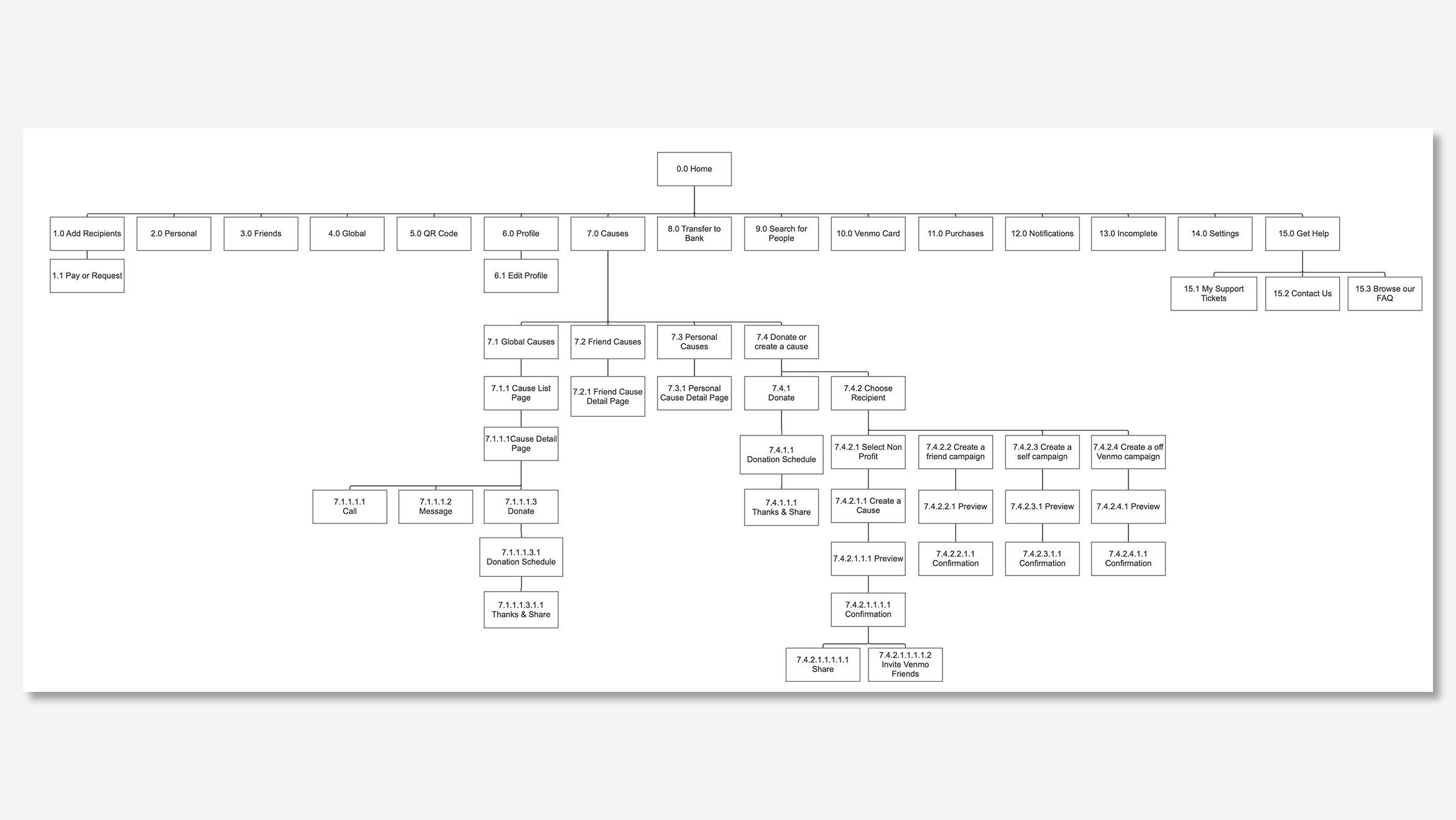
App Map I created showing how the "7.0 Causes" feature fits into the existing app information architecture.
Sketches, wireframes, and usability testing
To generate ideas I did a 4-round design challenge, each round was 5 minutes of sketching, 2 minutes presenting to the team, and 5 minutes of feedback. Each team member did this for their user flow. Post-challenge, I did a series of sketches to refine the ideas for the paper prototypes and usability testing.
- Creating a way to explore causes
- A way users to donate to causes
- Ways for users to connect with causes
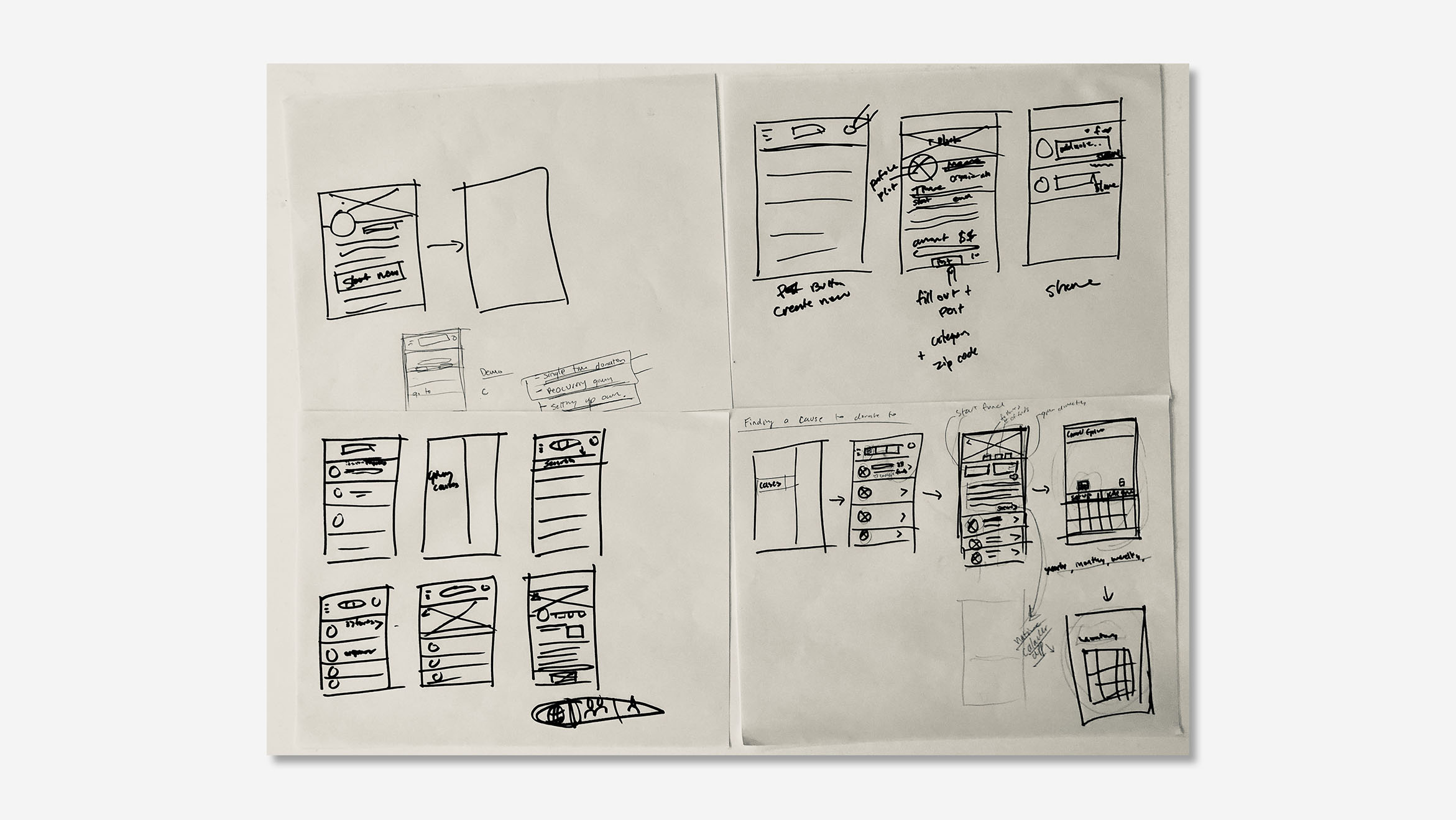
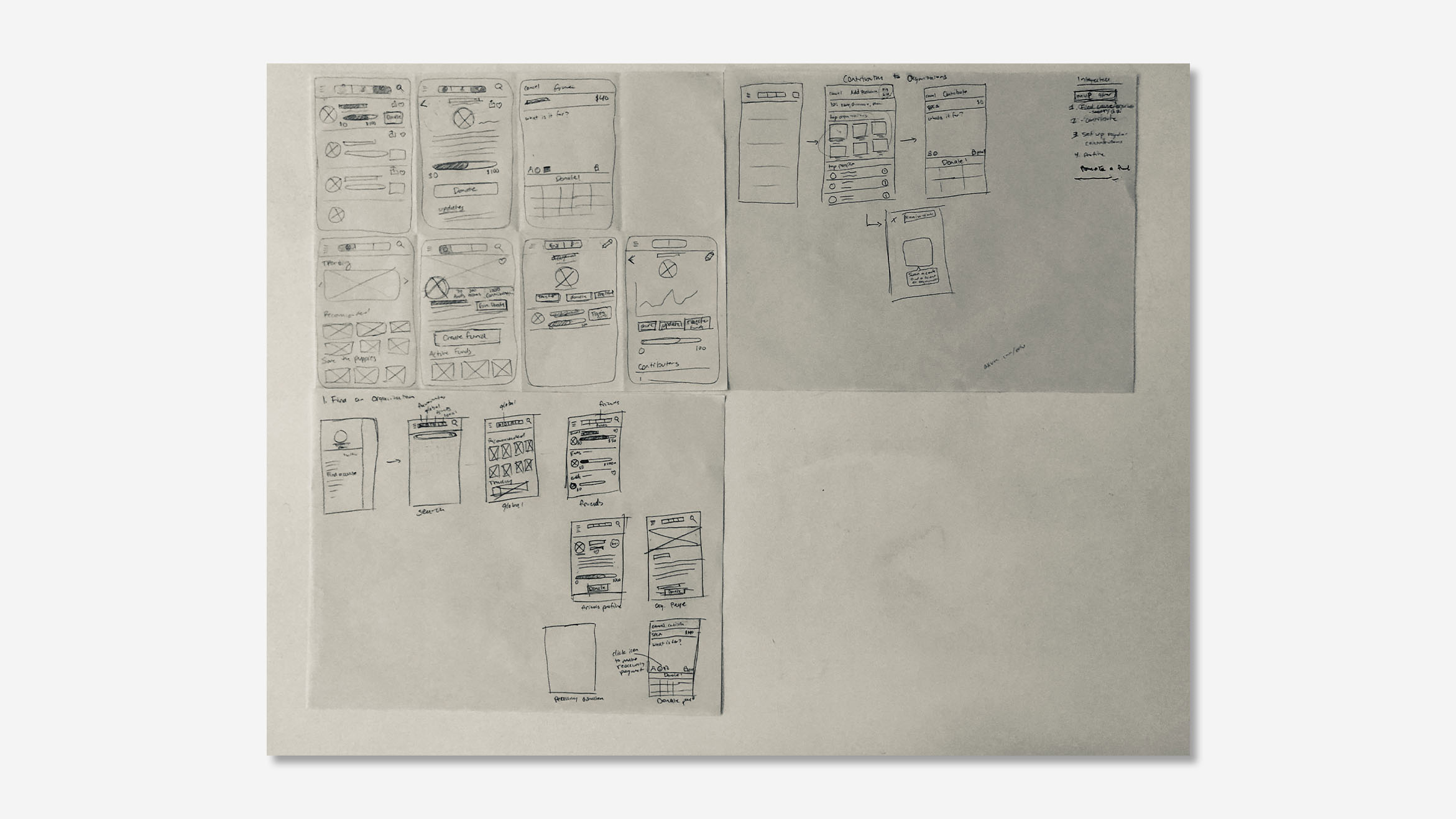
My design challenge sketches testing how people access the causes feature, and find a cause to fund.
Usability tests
To quickly test my design I created some rough wireframes and performed a series of 3 paper prototype usability tests with the target user. My goal was to test the placement of the cause feature in the drawer nav. and resolve major structural roadblocks before committing to a clickable prototype.
Key insights
- Took several clicks for people to find cause feature, onboarding would be necessary
- Users need more differentiation between the transaction and cause sections
- They wanted to see many large images of causes when exploring
- Users wanted a way to contact the organization directly through the app
As a result of the usability test I added more images, a way to contact the organization, "cause" label in the global nav for orientation, and sketched out an onboarding concept but due to time was not able to translate it into a wireframe.
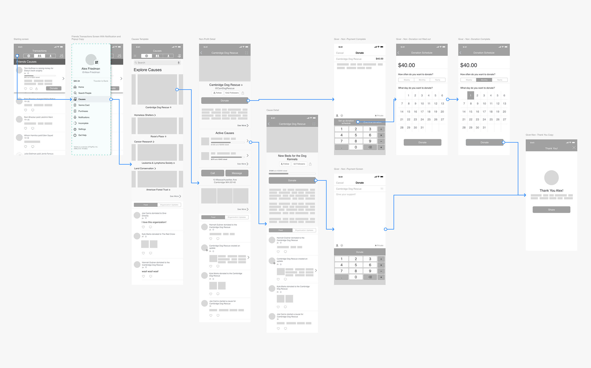
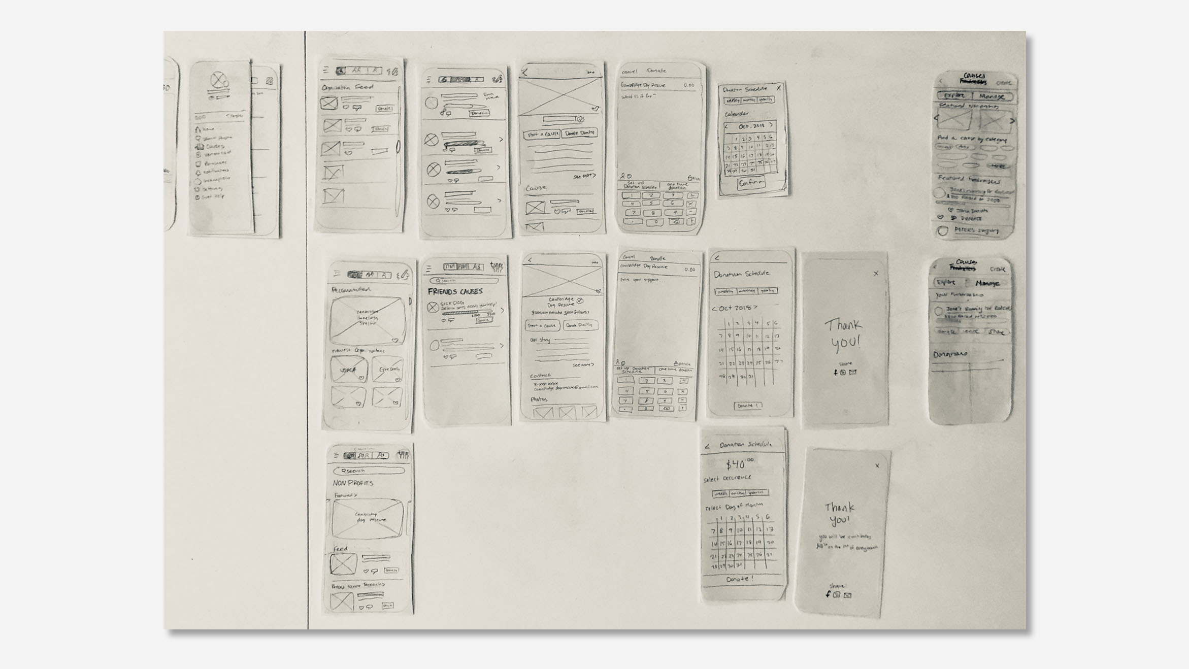
The wireflow of exploring, donating, sharing.
Onboarding
Usability testing revealed that users had to click several times to find the new cause feature which is decidedly separated from the transaction section of Venmo. This decision meant that users needed to be oriented on its location.
The onboarding would point out the location of Cause feature and include a short survey to help refine what causes would be relevant to the user.
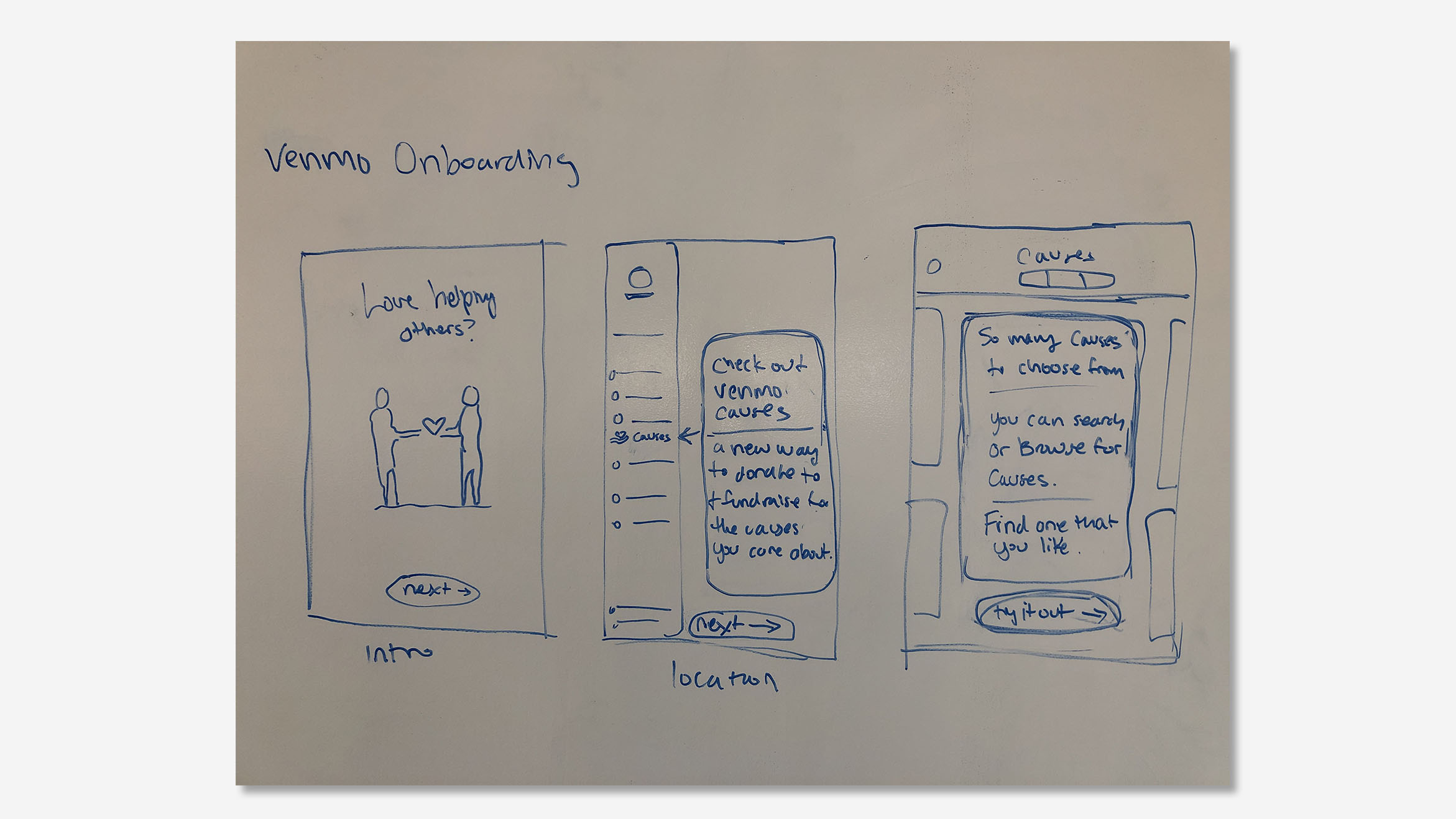
Sketch of onboarding process for new feature.
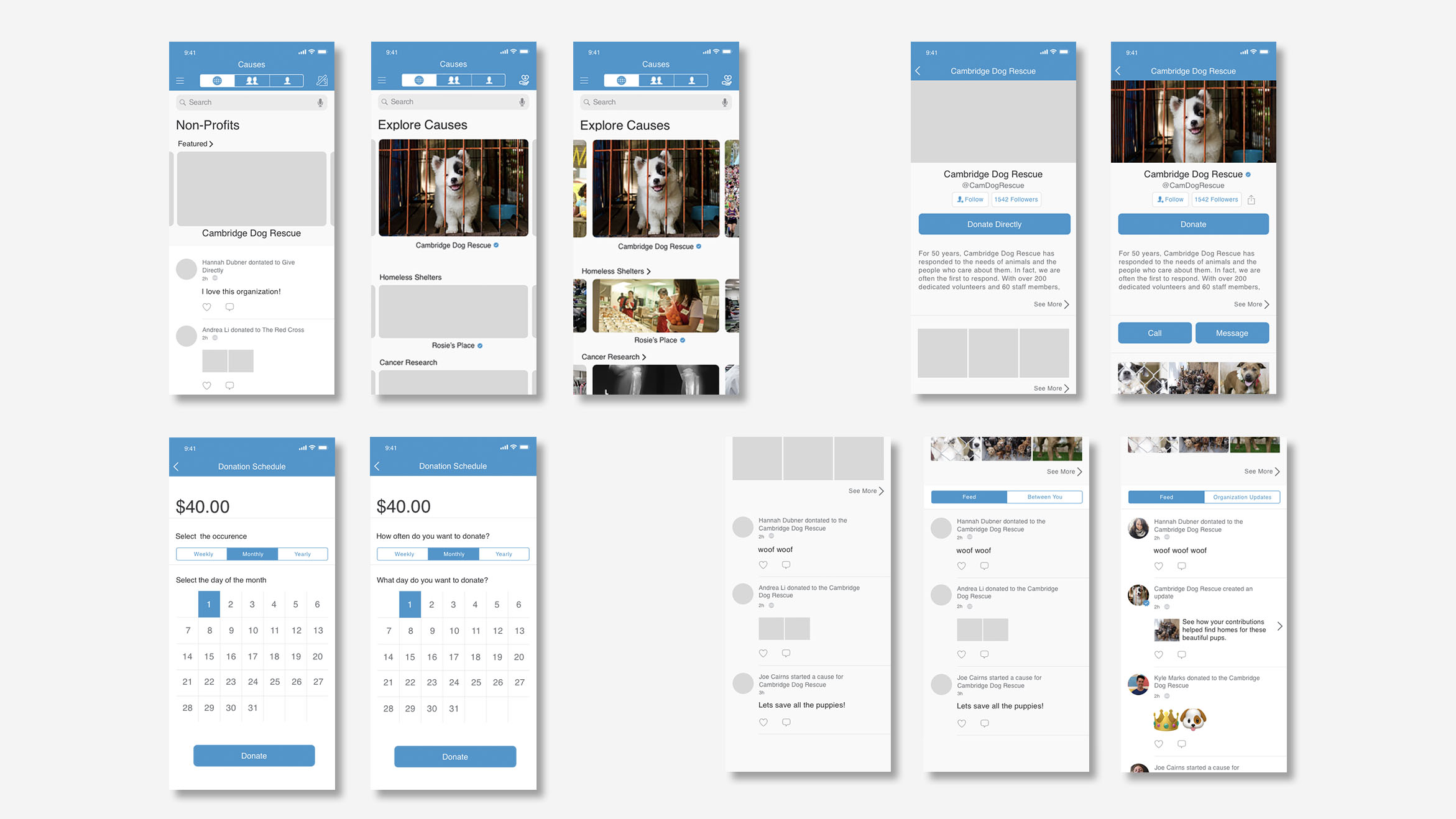
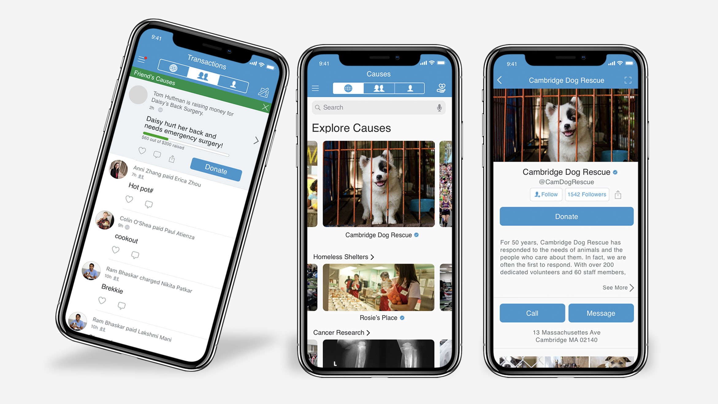
Exploring Causes
It was important when designing this aspect of the feature to consider how people connect with organizations in order to encourage them to donate. I felt it was important for people to be able to search as well as browse for causes.
Users can search using keywords and tags and refine the search by location which works toward accomplishing goal #2. The explore page would also include browsing which would be organized into categories that are tailored toward your interests selected in the onboarding process.
According to my interviews, users found the feed confusing and useless. I felt that it provided an interesting opportunity to create more meaningful connections between users and organizations. By displaying written and pictorial/video updates from the organization, people could see how the donations have helped which answers goal #3.
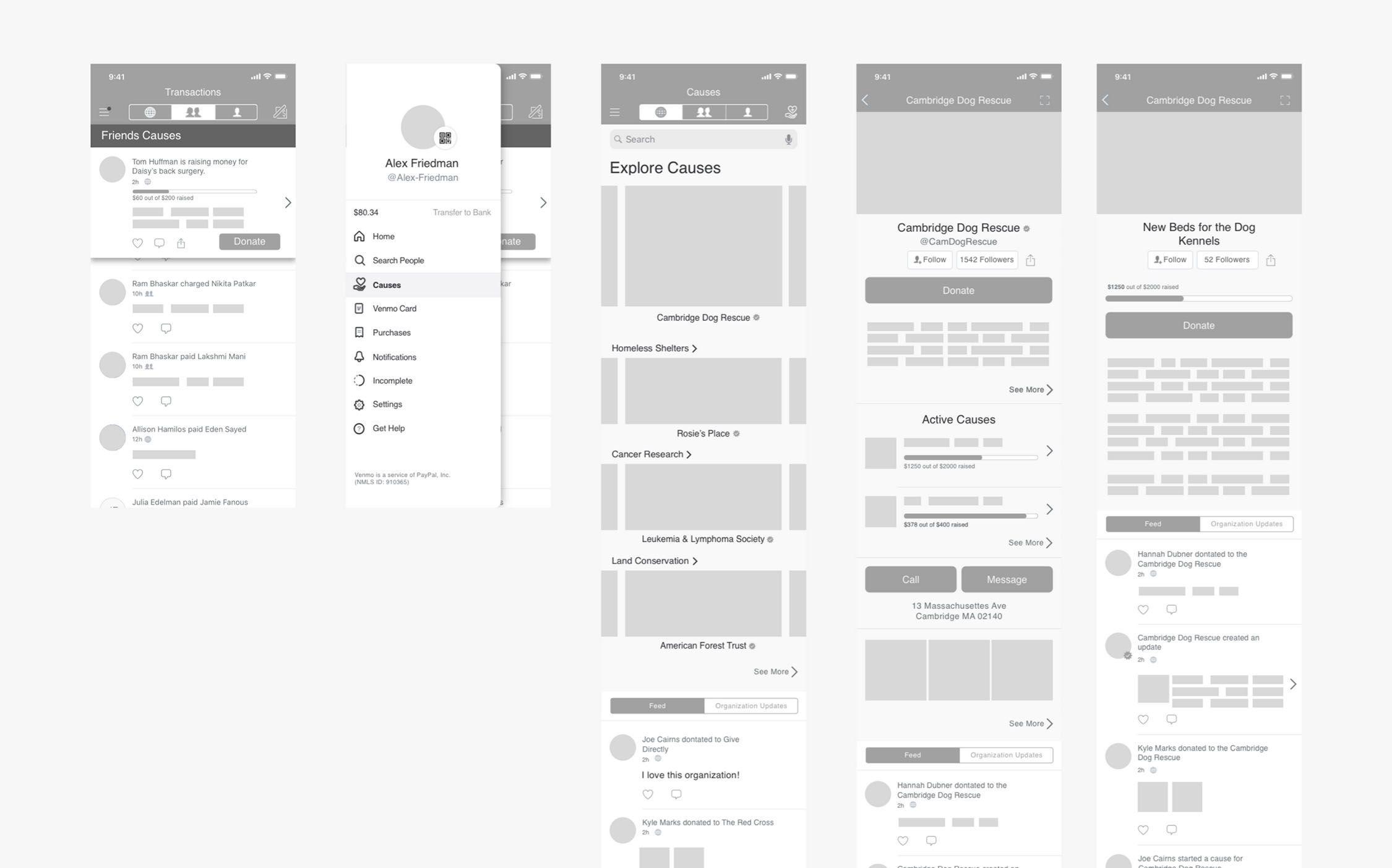
Explore screens. Left to right, transaction page with donation notification, drawer navigation with cause section, home page of causes section, organization detail page, organization cause page.
Setting up donations
From my research, I found that people donate in two different ways. Some users are inspired by time-based donations tailor toward accomplishing a specific goal. In response to this, I included an "Active Causes" section on the specific organization page where users can donate toward specific goals.
Other users want to donate to the general organization in a simple recurring payment. For this, I designed a donation schedule that can be accessed from the donate section. This allows the user to donate a recurring amount as frequently as they want. The donation schedule would be accompanied by a notification reminder prior to the donation day and a management system that would allow users to change their donation schedule.
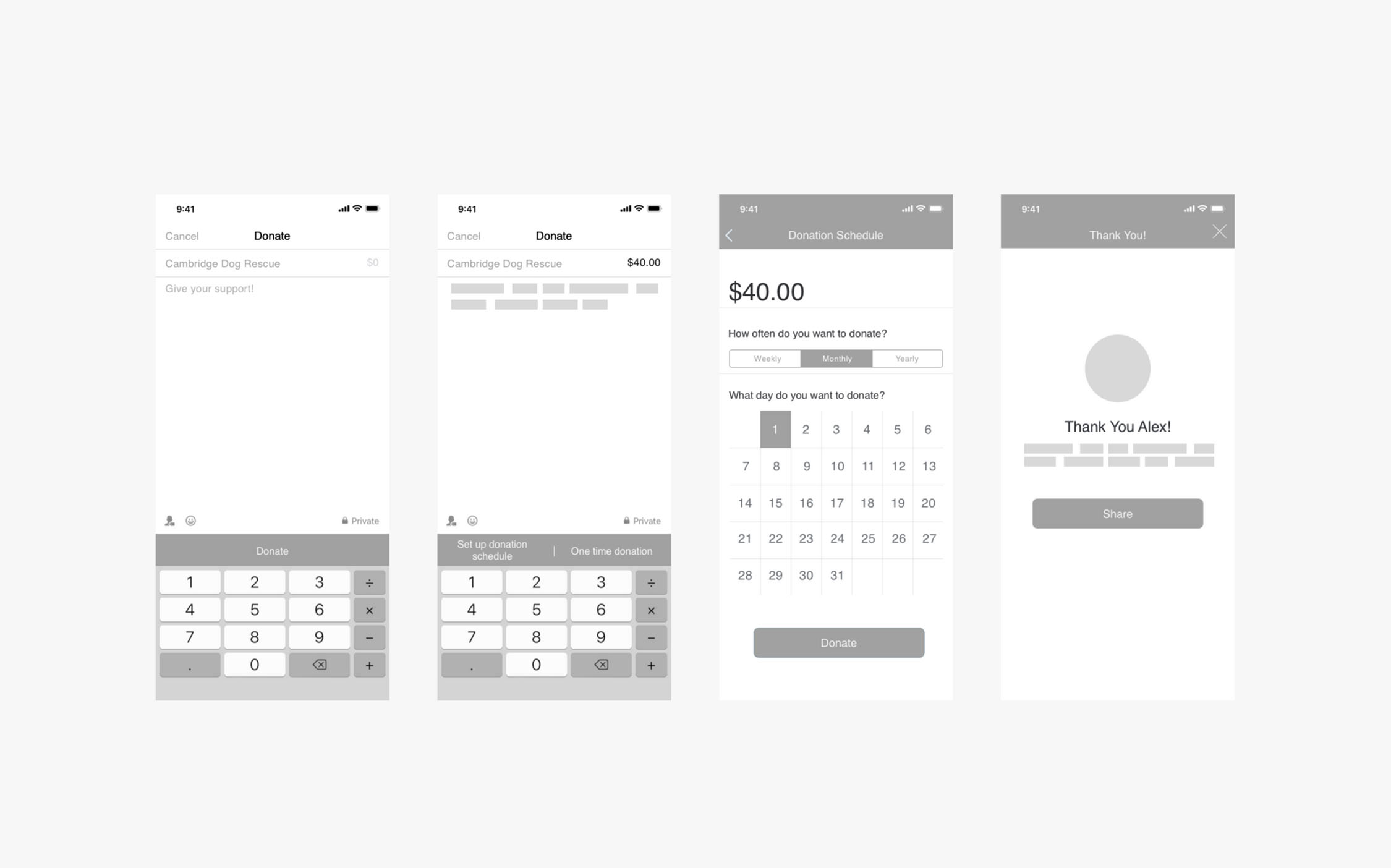
Donation screens. Left to right, standard donation, recurring donation, donation schedule, thank you.
High fidelity
I performed 4 rounds of usability testing with 2 participants per round, which lead to the following insights:
- Less specificity in button labels, ex: "Donate Directly" changed to "Donate"
- Need for humanized tone in headings and prompts
- There was a repeating desire for more categories of causes to scroll through on global causes page
- The feed was confusing and needed a purpose
Iterations of secific screens in the user flow. Cause landing page (top left), cause detail page (top right), dontation schedule page (bottom left), feed (bottom right).
Next steps
I was incredibly inspired by this project. With all the different accounts required donating can be far too difficult, by consolidating the donation onto one money exchange platform could make a real difference for people.
If I were to continue with the project I would want to look into how to utilize the leftover "Venmo money" that most Venmo users' have in their accounts for donation. Many of the users I talked with regularly have money sitting in their Venmo accounts, this money could be donated.
Another option to explore could be allowing users to donate a percentage of their transactions toward a cause of their choice.
MORE
© 2023 Taylor Baer. All rights reserved.